


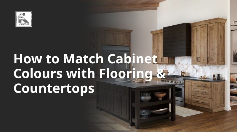
Blog
How to Match Cabinet Colours with Flooring & Countertops
Jun
Your kitchen is the heart of your home — and nothing defines its personality more than the relationship between your cabinet colours, flooring, and countertops. Get this combination right, and every meal prep feels like a joy. Get it wrong, and even a renovated kitchen can feel oddly ‘off.’
Matching these three core elements is one of the most common challenges homeowners face during a kitchen renovation or new build. With hundreds of cabinet finishes, dozens of flooring materials, and an overwhelming range of countertop options, making confident decisions can feel impossible.
That’s exactly why we created this comprehensive guide. At KASA Kitchens, our design team has helped thousands of Canadian homeowners navigate these decisions — and in this article, we’re sharing everything we know, from fundamental colour theory to specific combination ideas you can bring straight to your next design meeting.
1. Why Getting the Colour Combination Right Matters
Before diving into specific pairings, it’s worth understanding why this matters so deeply. Unlike a sofa you can swap out or a wall you can repaint in an afternoon, kitchens are long-term investments. According to HomeStars and multiple Canadian renovation industry sources, the average kitchen renovation in Canada costs approximately $30,944 CAD — with most mid-range projects falling between $15,000 and $50,000 CAD — and most homeowners live with that result for 10 to 20 years.
The cabinet-flooring-countertop triangle forms what designers call a ‘visual anchor triangle.’ Each element occupies significant visual real estate in your kitchen:
- Cabinets: typically 40–60% of the kitchen’s visible surface area
- Flooring: the visual foundation that connects the whole room
- Countertops: the horizontal ‘stage’ where daily life happens
When these three elements work in harmony, your kitchen feels cohesive, intentional, and comfortable. When they clash or are merely neutral toward each other, the space feels unsettled — even if each element is individually beautiful.
Expert insight: Colour coherence is not about matching everything perfectly — it’s about creating intentional contrast and visual flow. The best kitchens have at least one anchor colour, one complementary tone, and one neutral base working together.
See More: Popular Kitchen Colour Trends in Ontario
2. Understanding Colour Theory for Kitchen Design
You don’t need a design degree to understand colour theory, but knowing a few key principles will transform the way you approach your kitchen decisions.
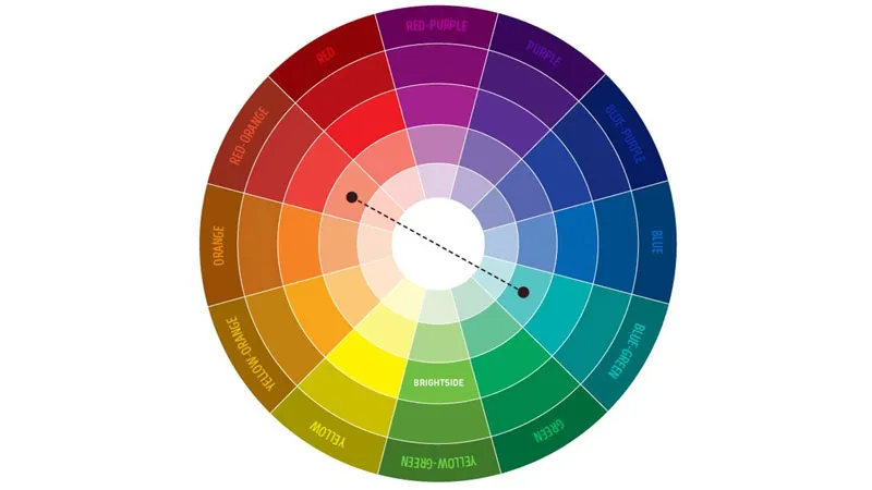
The Colour Wheel Basics
The colour wheel organises hues in a circular arrangement, and it’s the foundation of all colour matching decisions. For kitchen design, these three relationships are most useful:
- Analogous colours: colours that sit next to each other on the wheel (e.g., green, teal, and blue). These create a serene, cohesive look perfect for calm, spa-like kitchens.
- Complementary colours: colours directly opposite each other (e.g., navy and warm timber). These create strong contrast and visual energy — ideal for bold, statement kitchens.
- Triadic colours: three colours equally spaced on the wheel. These are complex to execute but can create vibrant, eclectic spaces when done well.
Warm vs Cool Tones
One of the fastest ways to create harmony or discord in a kitchen is through warm and cool tone mixing. Understanding this distinction is crucial:
- Warm tones: creams, beiges, terracotta, honey oak, warm whites. These create an inviting, cosy atmosphere.
- Cool tones: greys, whites with blue undertones, slate, charcoal, crisp white. These feel clean, modern, and spacious.
The golden rule: mix warm with warm, or cool with cool. Mixing a warm cream cabinet with a cool grey floor can create an unsettling visual tension — unless you deliberately bridge the gap with a neutral countertop.
The 60-30-10 Rule
Borrowed from interior design, the 60-30-10 rule is a reliable framework for kitchen colour distribution:
- 60% dominant colour — usually the cabinets or flooring (the largest surfaces)
- 30% secondary colour — typically the countertops or a contrasting element
- 10% accent colour — hardware, splashback tiles, or fixtures
This proportion keeps the space visually balanced without feeling bland or overly busy.
3. Choosing Your Starting Point: Cabinet, Floor, or Countertop?
Most homeowners make the mistake of trying to decide all three elements simultaneously. The experienced approach is to choose a starting anchor, then build outward. Here’s how to decide which element to anchor on:
Start with Flooring If…
- You’re keeping existing floors (the most common scenario in renovations)
- Your flooring is a bold or distinctive material like dark hardwood or patterned tiles
- Your home has open-plan living where floor continuity matters
In this case, lay flooring samples in your kitchen and build your cabinet and countertop palette around them.
Start with Cabinets If…
- You have a specific cabinet colour or finish in mind that inspired the renovation
- You’re ordering custom cabinetry with a long lead time
- You’re doing a full gut-renovation with no pre-existing constraints
Start with Countertops If…
- You’ve fallen in love with a specific stone slab (common with marble and engineered stone)
- Your countertop is a premium material like Calacatta marble or Caesarstone
- The countertop has complex veining with multiple tones you can pull from
Many designers actually recommend starting with the countertop — particularly with natural stone — because the slab is the most unique, fixed element with the least flexibility for substitution.
See More: Best Kitchen Colours for Condos & Rentals
4. Matching Cabinet Colours with Flooring: The Complete Guide
Flooring sets the tonal foundation for everything above it. Here are the most common flooring types and how to pair them with cabinet colours:
Light Timber / Oak Flooring
Light timber floors are among the most popular choices in Canadian homes. Their warm honey tones and natural grain create a welcoming base.
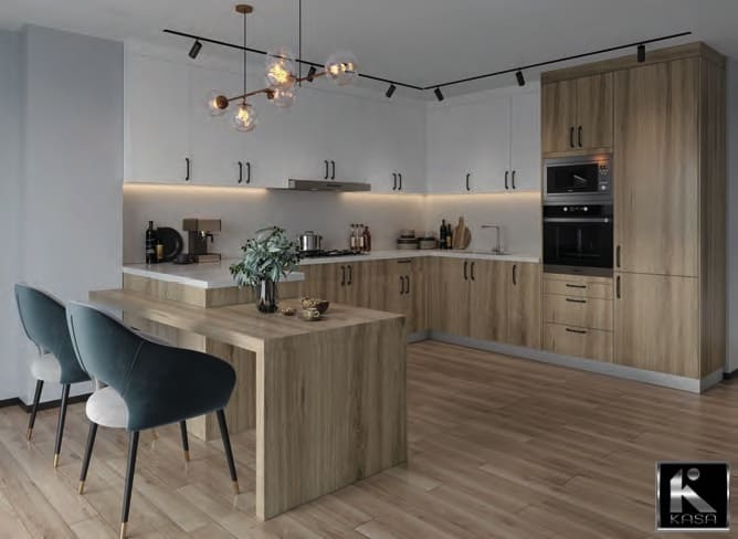
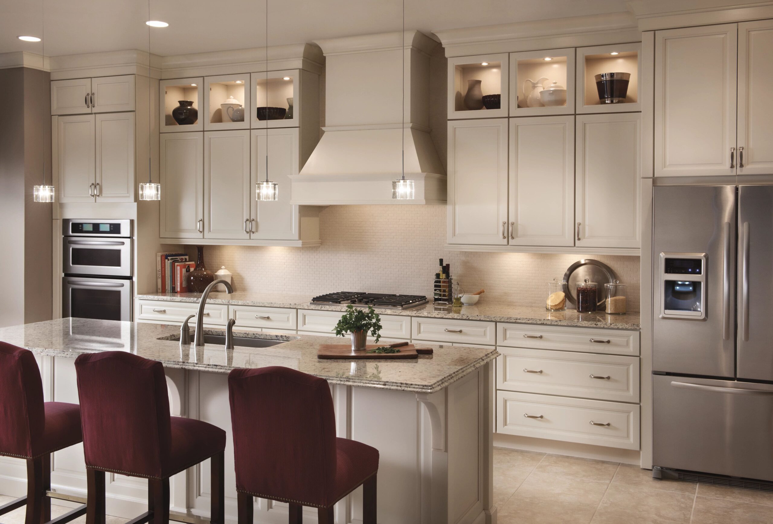
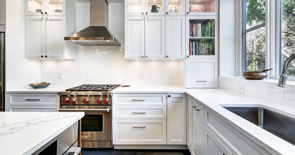
- White or off-white cabinets: A timeless, Scandi-inspired combination. The white lifts the space without competing with the floor’s warmth.
- Sage green or soft navy cabinets: These provide a sophisticated contrast. The timber warms what could otherwise be a cold palette.
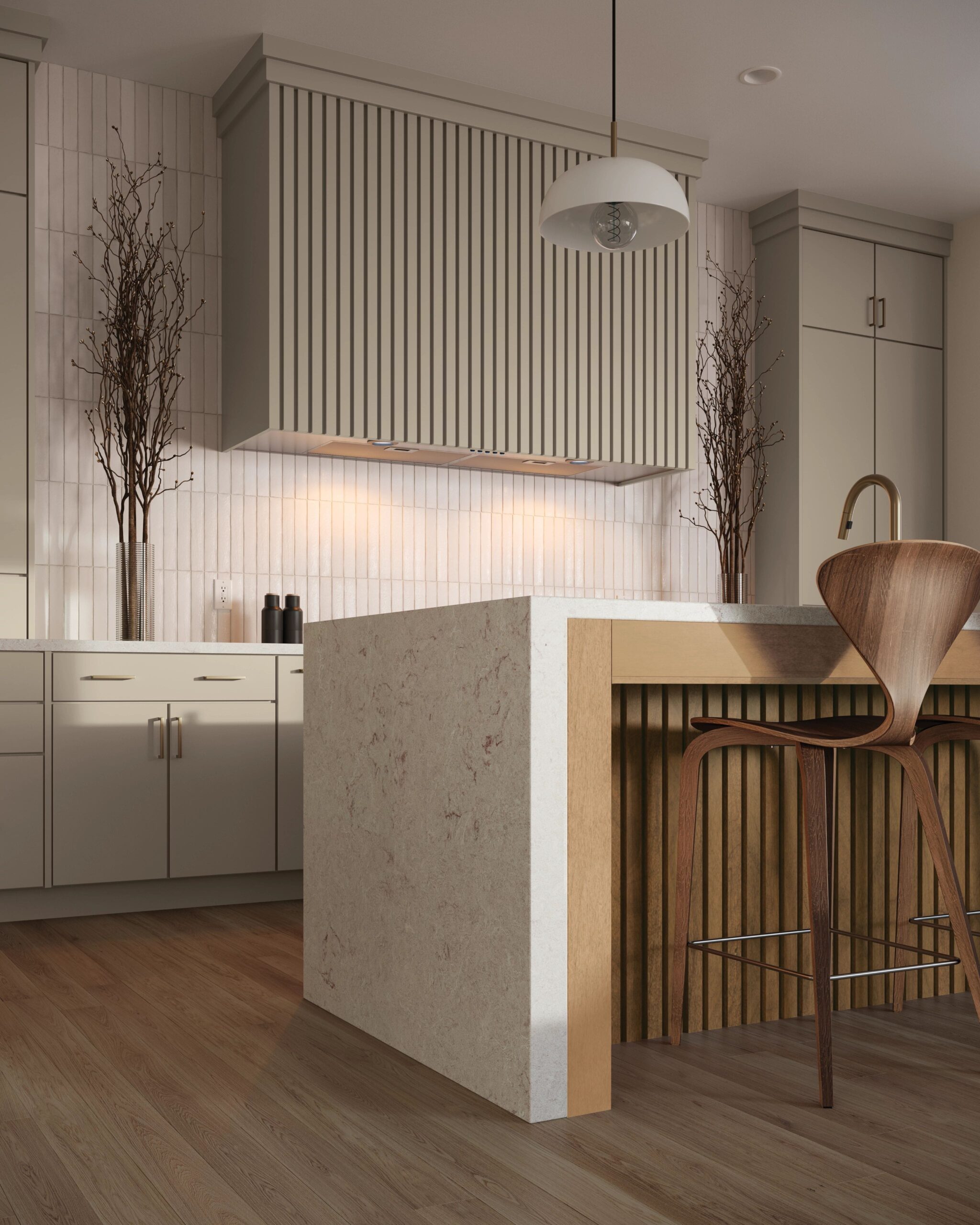
- Greige or warm grey cabinets: A highly contemporary pairing that feels premium without being stark.
- Avoid: Cool charcoal or blue-grey cabinets, which can fight with the warm undertones of oak.
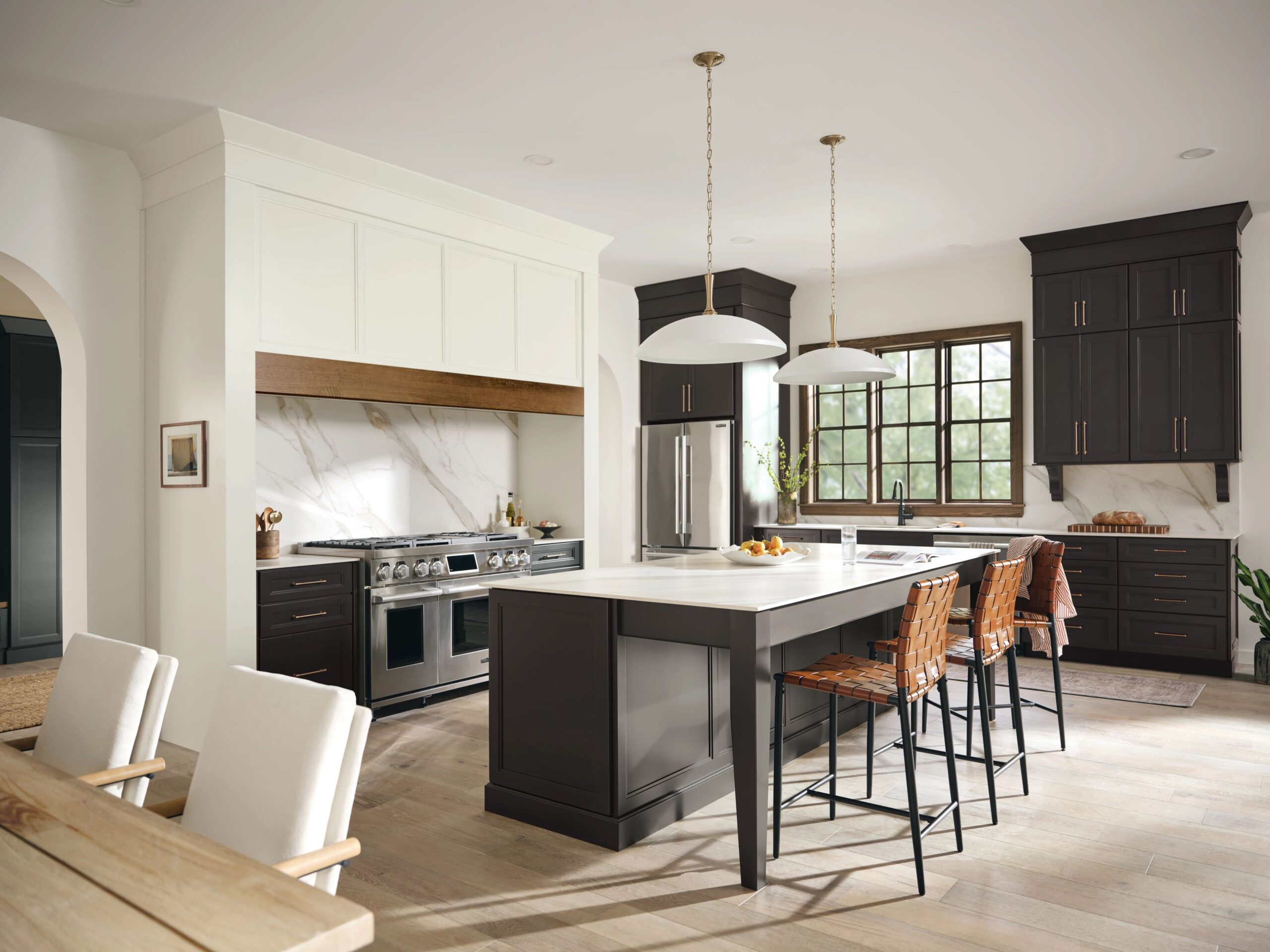
Dark Timber / Walnut Flooring
Dark floors make a dramatic statement and require careful cabinet pairing to avoid a heavy, cave-like feeling.
- White or light grey cabinets: Create maximum contrast and keep the space feeling open. The classic choice.
- Pale timber cabinets (in a lighter shade): Tonal layering — different depths of the same wood family. Works beautifully in organic, earthy schemes.
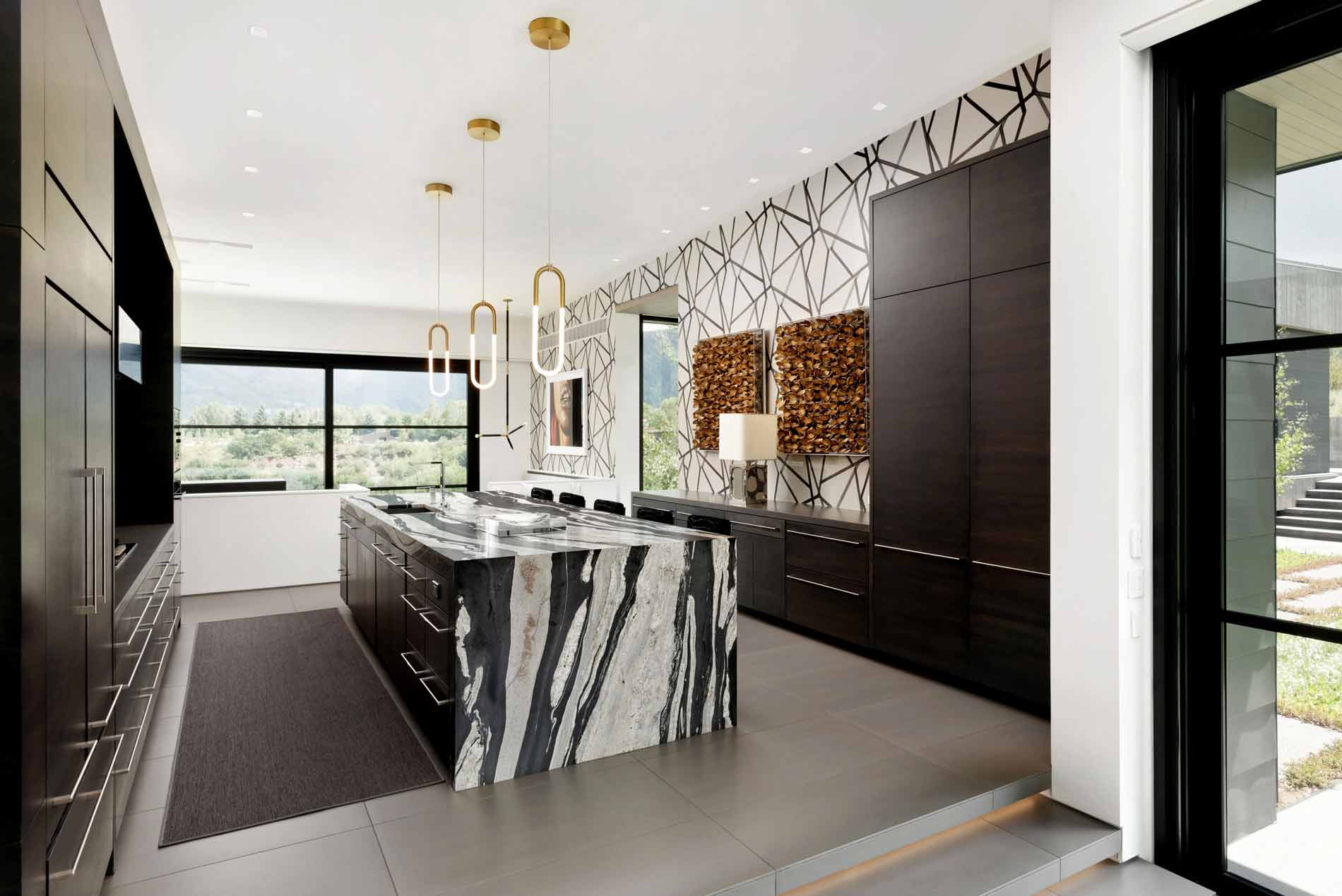
- Navy blue cabinets: Bold and sophisticated. The richness of both elements creates an intentionally dramatic space.
- Avoid: Very dark green or black cabinets, which, while trending, can feel oppressive in smaller kitchens.
Grey Tiles / Concrete-Effect Flooring
Grey floors are cool, contemporary, and exceptionally versatile — making them one of the easiest flooring types to pair.
- White cabinets: The ultimate modern kitchen. Clean, crisp, and timelessly stylish.
- Two-tone cabinets (white upper / charcoal lower): Adds depth and interest to an otherwise monochromatic scheme.
- Soft dusty pink or terracotta cabinets: A contemporary, unexpected pairing that’s increasingly popular in interior design.
- Timber-effect cabinets: The grey floor provides a cool contrast to warm timber doors — sophisticated and balanced.
Terracotta / Encaustic Tiles
Patterned and terracotta floors make a strong statement. Cabinets need to step back and let the floor shine.
- Off-white or cream cabinets: Allows the floor to be the star. Clean and unfussy above a busy floor.
- Warm green cabinets: Earthy, botanical, and perfectly complementary to the terracotta palette.
- Natural timber cabinets: Harmonises with the rustic, artisanal character of the tiles.
Polished Concrete / Dark Tiles
These industrial-feel floors suit modern, urban kitchens and work best with cabinets that acknowledge the edginess of the material.
- Matte black cabinets: Fully commits to the industrial aesthetic.
- Brushed steel or metallic cabinet finishes: Echoes the cool, raw quality of concrete.
- Crisp white with black hardware: A graphic, high-contrast look that photographs exceptionally well.
See More: Solid Wood Doors vs Painted HDF Doors: Which Should You Choose?
5. Matching Cabinet Colours with Countertops: The Complete Guide
Countertops and cabinets are in the closest visual relationship in any kitchen — they share the same horizontal-meets-vertical plane, making their pairing the most immediately noticeable combination in the space.
White Quartz / Engineered Stone Countertops
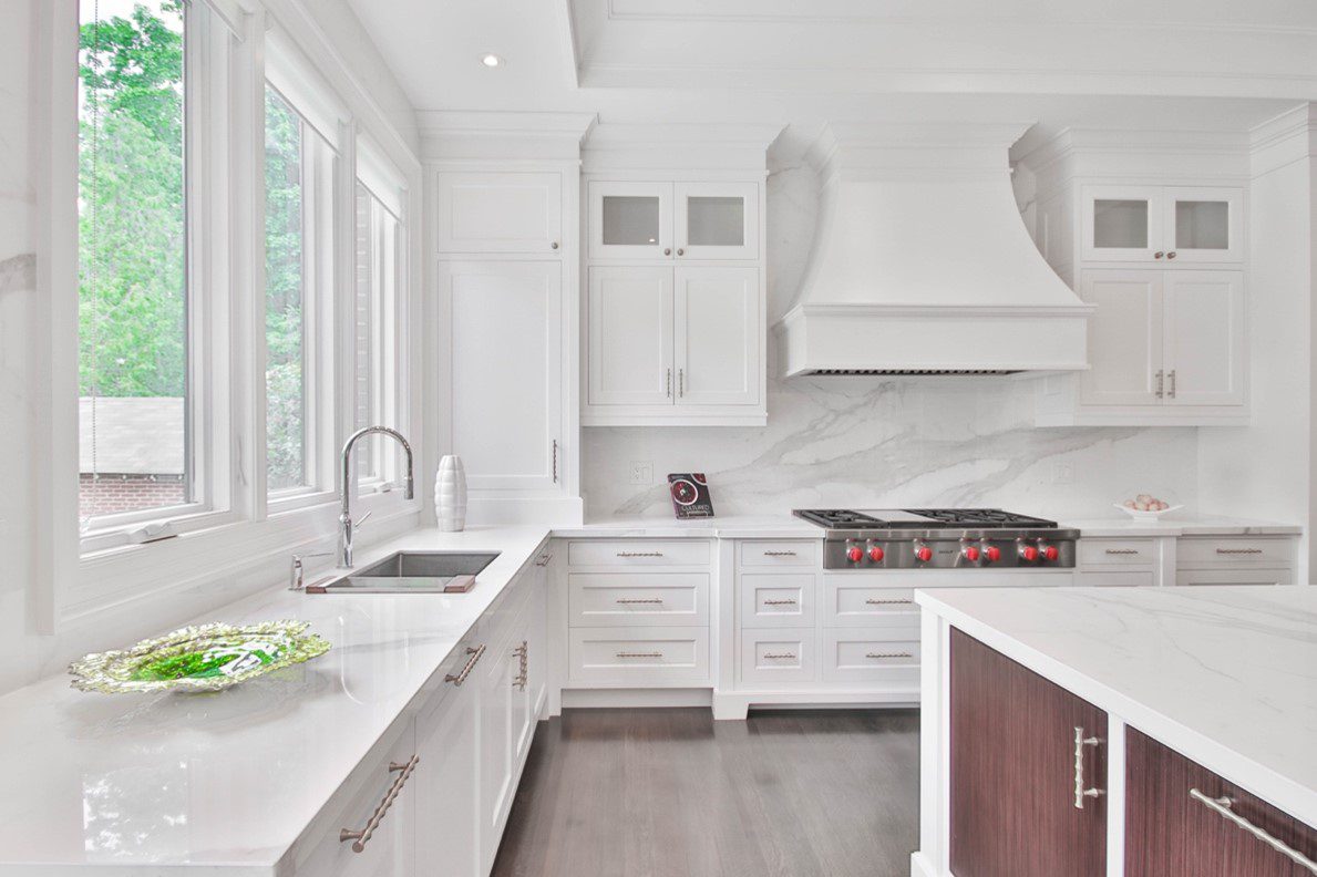
White countertops are the most universally versatile option and pair well with almost every cabinet colour.
- White cabinets: All-white kitchens remain hugely popular. The key is using texture variation — matte cabinets with glossy stone, or v-groove detailing — to prevent the space from looking flat.
- Timber or warm-toned cabinets: The white countertop ‘lifts’ the warmth of the timber without competing.
- Bold coloured cabinets (navy, forest green, deep sage): White countertops ground and balance strong cabinet colours beautifully.
Marble / Calacatta / Veined Stone
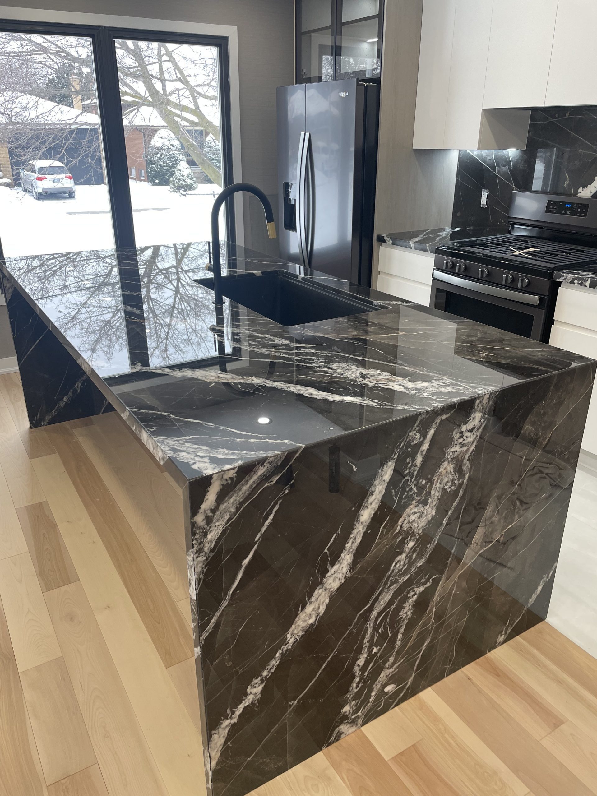
Veined stone slabs are statement pieces. Their beauty is in the natural variation of colour within the stone — and the best pairings pull from the tones already present in the slab.
- White or off-white cabinets: Classic and elegant. The marble gets to perform as the focal point.
- Warm greige cabinets: The grey-beige tone mirrors the background of many Calacatta stones.
- Soft sage or dusty green: Picks up the subtle green undertones common in many natural marbles.
Pro tip from KASA Kitchens: Always view your exact slab in person before finalising your cabinet colour. No two marble slabs are identical, and the veining colour will influence your pairing decision significantly.
Dark Granite / Black Quartz Countertops
Dark countertops are dramatic and bold — they work best when the cabinets provide either strong contrast or tonal consistency.
- White cabinets: The graphic contrast of black countertops on white cabinets is a perennially popular choice. Feels bold but remains timeless.
- Light timber cabinets: The warmth of the timber softens the drama of dark stone, creating a balanced, contemporary look.
- Two-tone: Light upper cabinets / black lower cabinets that match the countertop — creates a continuous dark ‘base’ that looks architecturally considered.
- Avoid: Very dark cabinets with very dark countertops unless deliberate and well-lit.
Timber / Butcher Block Countertops
Timber countertops bring warmth and natural beauty — they’re particularly popular in rustic, farmhouse, and organic-modern kitchens.
- White painted cabinets: The warm timber countertop prevents white kitchens from feeling clinical.
- Sage or olive green cabinets: Earthy, botanical, and richly textured.
- Navy or charcoal base cabinets with white uppers: The timber counter bridges the gap beautifully.
Concrete / Industrial Countertops
Poured or precast concrete countertops suit modern, architectural, and industrial-style kitchens.
- Matte white or off-white cabinets: Lets the texture of the concrete be the feature.
- Charcoal or black cabinets: A fully committed industrial scheme.
- Timber veneer cabinets: Grounds the rawness of concrete with warmth.
See More: How Much Should You Budget for Kitchen Cabinets in Canada?
6. Quick Reference: Cabinet Colour Combination Guide
Use this at-a-glance table when making your decision:
| Cabinet Color | Best Flooring Pairs | Best Countertop Pairs | Overall Mood |
| White Cabinets | Any — oak, grey tile, dark timber | White quartz, marble, dark granite, timber | Timeless, versatile, bright |
| Navy / Deep Blue | Light oak, grey tile, white tile | White quartz, Calacatta marble, brass/timber | Bold, sophisticated, dramatic |
| Sage / Olive Green | Light timber, terracotta, encaustic tile | White stone, marble, timber butcher block | Earthy, botanical, organic |
| Charcoal / Dark Grey | White tile, light timber, polished concrete | White quartz, light marble, brass-veined stone | Modern, sleek, dramatic |
| Warm Cream / Greige | Warm oak, terracotta tile, natural stone | White quartz, warm marble, timber | Cosy, classic, inviting |
| Black Cabinets | White tile, polished concrete, light timber | White quartz, concrete, veined stone | Ultra-modern, edgy, bold |
| Timber / Wood Veneer | Grey tile, polished concrete, neutral tile | White stone, dark granite, concrete | Warm, organic, natural |
7. The Three-Way Balance: Bringing It All Together
Matching cabinets to floors and countertops independently is one thing — but the real art is in balancing all three simultaneously. Here are four proven three-way combinations our KASA Kitchens designers return to again and again:
Combination 1: The Modern Classic
- Cabinets: Matte white shaker doors
- Flooring: Natural oak timber
- Countertop: White Calacatta marble or engineered marble
Why it works: The warmth of the oak prevents the white-on-white combination from feeling sterile. The marble introduces subtle veining for visual interest. Universally appealing and highly resale-friendly.
Combination 2: The Bold Botanist
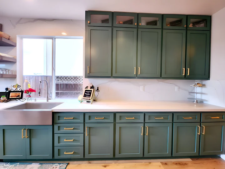
- Cabinets: Forest green or sage green
- Flooring: Warm honey oak or terracotta tiles
- Countertop: Warm white quartz or marble with gold veining
Why it works: The green-and-timber pairing echoes nature. The warm stone countertop unifies the earthy palette. Rich, character-filled, and highly on-trend for 2024-2025.
Combination 3: The Urban Sophisticate
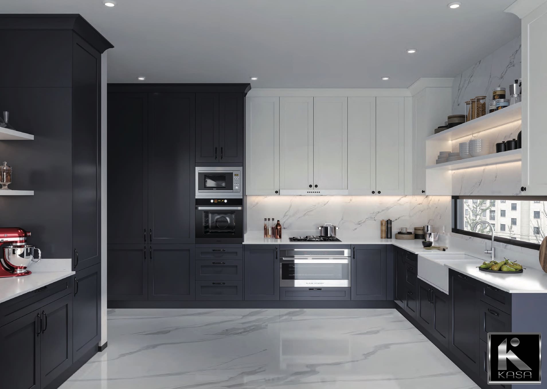
- Cabinets: Two-tone — white uppers, charcoal or navy lowers
- Flooring: Large format grey tiles or polished concrete
- Countertop: Dramatic black quartz or dark grey veined stone
Why it works: The cool grey floor and dark stone create a consistent base tone. The white upper cabinets lift the scheme and provide brightness. Graphic, contemporary, and photogenic.
Combination 4: The Warm Minimalist
- Cabinets: Warm greige or pale linen
- Flooring: Warm grey stone tile or muted terracotta
- Countertop: Soft white stone with minimal veining
Why it works: Tonal harmony across warm neutrals creates a serene, spa-like kitchen. Nothing competes — everything breathes. A beautifully calm, grown-up aesthetic.
See More: Modern Slab Doors vs Shaker Cabinets: Which Fits Your Home?
8. Common Mistakes to Avoid
Even with the best intentions, these design errors trip up many homeowners:
Mistake 1: Choosing Colours from Samples Alone
Small sample chips are notoriously unreliable. Colours shift dramatically depending on lighting conditions, room size, and surrounding materials. Always view larger samples — ideally door-sized — in your actual kitchen space under natural and artificial light.
Mistake 2: Ignoring Undertones
A cabinet listed as ‘white’ may have pink, yellow, green, or blue undertones. A floor listed as ‘grey’ may lean warm or cool. Clashing undertones create subtle but persistent visual discomfort. Hold your samples together in direct light and look for undertone alignment.
Mistake 3: Overlooking the Light in Your Kitchen
In Canada, south-facing kitchens receive warm, abundant afternoon light that enriches warm tones. North-facing kitchens receive cooler, more diffuse light that can deaden warm colours and brighten cool ones. Factor in your kitchen’s orientation when making colour decisions.
Mistake 4: Forgetting the Hardware and Fixtures
Cabinet hardware, tapware, and appliance finishes form the ‘10%’ accent element in your kitchen. A warm cabinet in brushed brass hardware will feel entirely different from the same cabinet with matte black handles. Define your hardware finish before finalising your colour palette.
Mistake 5: Playing It Too Safe
While neutral palettes are safe, they can result in kitchens that feel underwhelming after the renovation excitement fades. Don’t be afraid of a statement island colour, a bold floor tile, or a textured cabinet finish. Purposeful boldness creates kitchens people actually love rather than merely like.
9. How Lighting Changes Everything
No guide on kitchen colour matching would be complete without addressing lighting — because light is the invisible fourth element in every colour combination.
- Natural daylight (cool) will intensify cool tones and mute warm ones. In south-facing kitchens, lean warmer in your palette to compensate.
- Warm LED or halogen lighting enriches timber and cream tones, making them feel richer. Use this to your advantage in cosy kitchen schemes.
- Cool white LED lighting suits grey, white, and crisp contemporary palettes — it enhances clarity without adding warmth.
- Under-cabinet lighting is a game-changer for countertop colour: the illumination directly across the stone surface reveals its texture and tone more accurately than overhead lighting.
KASA Kitchens always recommends requesting a lighting consultation as part of any kitchen design process. Our designers can overlay your lighting plan with your colour selections to ensure your choices perform as expected once installed.
See More: Which Cabinet Material Lasts Longer for Canadian Condos, Basements & Rentals?
10. Practical Tips for Making Your Final Decision
Before you commit to your final combination, use this decision checklist recommended by our KASA Kitchens design team:
- Gather all samples — large, full-size samples where possible — and lay them on the kitchen floor together.
- View them at three times of day: morning natural light, midday, and evening under your planned artificial lighting.
- Live with them for at least a week before ordering. Take photos in different lighting to review.
- Check the undertones of each element against each other by viewing them side by side in natural light.
- Consider the finish as well as the colour: matte, gloss, textured, and polished finishes all read differently.
- Think about practical maintenance: lighter countertops show stains; darker floors show dust. Make sure your palette suits your lifestyle.
- Consult a professional. A 45-minute design consultation can save months of regret.
11. Current Kitchen Colour Trends in Canada (2024–2025)
While timeless combinations never go out of style, staying aware of current trends helps you make decisions that feel fresh and relevant:
- Warm neutrals are dominant: Greige, warm white, and natural linen tones are replacing the cool greys that dominated the previous decade.
- Green is the new grey: Forest green, sage, and olive are the standout cabinet colours of the moment — increasingly seen in kitchens across Canada.
- Timber is back: Warm timber veneer cabinetry, particularly in oak, walnut, and raw maple finishes, is experiencing a strong resurgence.
- Two-tone kitchens are mainstream: Once a design statement, two-tone cabinet combinations (light upper / dark lower) are now a widely adopted standard.
- Fluted and reeded cabinet textures: Texture is being used to add interest without adding colour — fluted cabinet doors in white or timber are particularly popular.
- Stone book-matching: Premium kitchen renovations are increasingly featuring book-matched stone slabs for dramatic visual impact on both countertops and splashbacks.
| “The three most common words we hear after a kitchen renovation are: ‘I love it.’ The three most common words we hear when something has gone wrong are: ‘It just doesn’t feel right.’ Almost always, that feeling comes down to a colour relationship that was decided in isolation rather than as a whole.”
— KASA Kitchens Team |
12. About KASA Kitchens: Expertise You Can Trust
KASA Kitchens is one of Canada’s leading kitchen design and manufacturing specialists, with a team of dedicated designers, craftspeople, and project managers who have collectively completed thousands of kitchen renovations across the country.
Our design approach is rooted in a deep understanding of how materials, colour, light, and proportion interact in real kitchen spaces — not just on a mood board. Every KASA Kitchens client benefits from:
- A personalised design consultation with a qualified kitchen designer
- Access to an extensive sample library including cabinet finishes, stone slabs, flooring, and hardware
- 3D rendered visualisations of your kitchen design before a single product is ordered
- Professional project management from design to installation
- A quality guarantee on all KASA products and installation work
We understand that a kitchen renovation is one of the largest investments you’ll make in your home. Our job is to make sure your decisions are informed, confident, and results in a kitchen you’ll love for decades.
See More: Best Cabinet Styles for Condos vs. Houses: A Complete Design Guide
Conclusion
Matching cabinet colours with flooring and countertops is both an art and a science. The principles in this guide — colour theory, tonal harmony, the 60-30-10 rule, and three-way balance — give you a reliable framework for making decisions with confidence.
Remember the key principles: start with your anchor element, match undertones carefully, use contrast intentionally, and never make final decisions from small samples alone. Your kitchen is a long-term investment in your home and your daily quality of life.
When in doubt, consult an expert. The right design guidance can save you thousands of dollars, months of uncertainty, and years of living with a result that doesn’t feel quite right.
| Ready to Design Your Dream Kitchen?
At KASA Kitchens, our expert designers help you choose the perfect cabinet, flooring, and countertop combinations that reflect your personal style and lifestyle needs. Visit KASA Kitchens Today — Book Your Free Design Consultation! www.kasakitchens.ca | Trusted by thousands of Canadian homeowners |
Frequently Asked Questions
What is the most popular kitchen cabinet colour in Canada right now?
As of 2024–2025, warm white, greige, and sage green are the most popular cabinet colours in Canadian kitchens. Warm timber veneer is also experiencing a strong resurgence in contemporary and organic-modern kitchen designs.
Should my kitchen cabinets match my floor?
Not necessarily — and in fact, matching too closely can make a kitchen feel flat and undifferentiated. The goal is harmony, not uniformity. Aim for colours that share undertones or sit in complementary relationships rather than perfect matches.
Can I mix warm and cool tones in my kitchen?
Yes, but do so deliberately. The key is to use a neutral element (often white stone countertops or natural timber) as a bridge between warm and cool tones. Avoid mixing warm and cool versions of the same colour — for example, a warm beige cabinet with a cool grey floor tends to create visual discomfort.
What countertop colour goes with white cabinets?
White cabinets are extremely versatile and work with almost any countertop. The most popular pairings are white marble or quartz (all-white kitchen), dark granite or black quartz (high contrast modern), and warm timber or butcher block (organic warmth). The choice depends on the overall mood and style you’re aiming for.
How do I choose kitchen colours for a small kitchen?
For small kitchens, lighter colours on cabinets and walls create an illusion of space — but avoid going all-white if it risks feeling clinical. A light neutral cabinet with a slightly contrasting countertop and continuous flooring into the adjacent space will make the kitchen feel larger. Reflective surfaces (gloss cabinets, polished stone) also help small kitchens feel more expansive.