


Blog
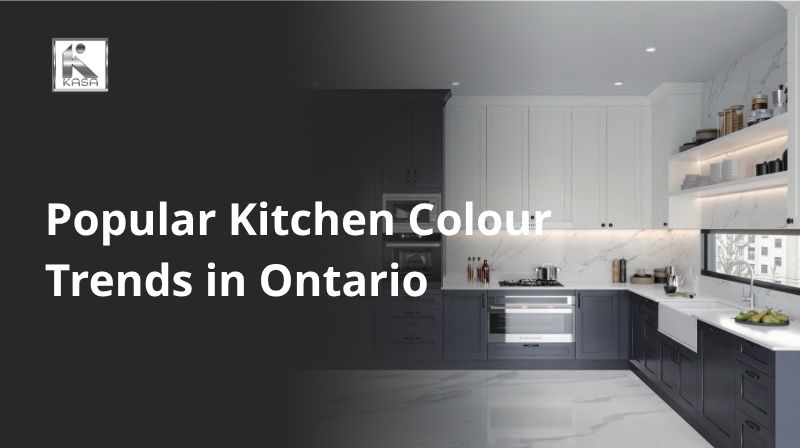
Popular Kitchen Colour Trends in Ontario
May
Your kitchen is the heart of your home — and nowhere is that more true than in Ontario, where open-concept living, entertaining culture, and a deep appreciation for quality craftsmanship converge. Whether you are renovating a century home in Toronto’s Annex neighbourhood, refreshing a semi in Mississauga, or building new in Barrie or Hamilton, one of the first and most impactful decisions you will make is colour.
Kitchen colour does not just set a visual mood; it influences perceived space, natural light, resale value, and daily wellbeing. A well-chosen palette can make a compact condo kitchen feel expansive, or give a large open-plan space warmth and definition. A poor choice, on the other hand, can date a renovation in just a few years.
| Expert Insight
According to the 2025 Kitchen Trends Report from the National Kitchen and Bath Association (NKBA), green is the most popular colour for kitchens, with 76% of surveyed designers selecting it as the top shade. Blue (63%), brown/wood tones (56%), and warm white (50%) follow closely behind. |
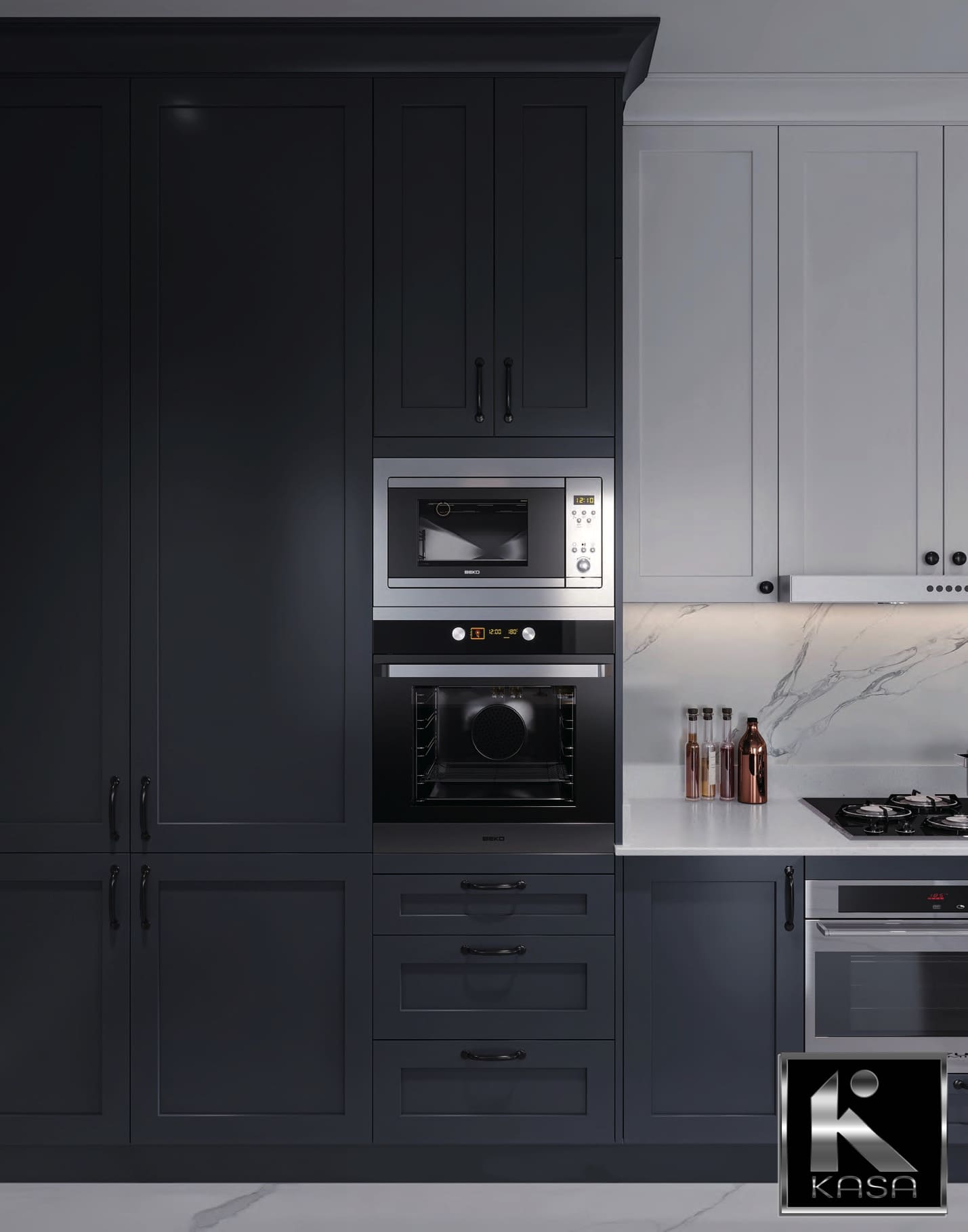
1. The End of Stark White — and What Is Replacing It
For more than a decade, the all-white kitchen reigned supreme across Ontario. Inspired by Scandinavian minimalism and amplified by social media, crisp white cabinetry, white quartz countertops, and white subway tile backsplashes became the default renovation choice from Ottawa to Windsor. That era is now decisively over.
Ontario designers are unanimous: stark, cold white is being replaced by a richer, more nuanced palette that still leans light and airy but incorporates warmth, depth, and natural character. The shift is not about abandoning brightness — it is about choosing warmth over clinical sterility.
What Is Replacing White?
- Creamy off-whites with warm undertones (ivory, linen, alabaster)
- Warm greige — a sophisticated blend of grey and beige
- Soft taupe with golden or rosy undertones
- Pale mushroom tones that sit between warm grey and brown
- Cashmere — a refined, slightly warm neutral inspired by natural fibres
The transition is subtle but significant. These off-white and warm neutral shades achieve the same light-amplifying effect as bright white, while eliminating the coldness and harshness that made pure white kitchens feel more like operating theatres than family gathering spaces.
In practical terms, this means Ontario homeowners are specifying cabinet colours like Benjamin Moore’s ‘White Dove’, Sherwin-Williams ‘Alabaster’, or Farrow & Ball ‘Clunch’ rather than stark optical whites. Paired with warm-toned brass or brushed gold hardware, these softer whites feel both current and timeless.
| Pro Tip from KASA Kitchens
When moving away from stark white, test your chosen warm neutral under both natural daylight and your kitchen’s artificial lighting. Ontario’s limited natural light in winter months can shift undertones dramatically. A warm cream that looks perfect in a sun-filled showroom may read yellow or orange in a north-facing kitchen. |
See More White Slim Shaker Kitchens
2. Warm Neutrals: The Dominant Colour Story of 2026
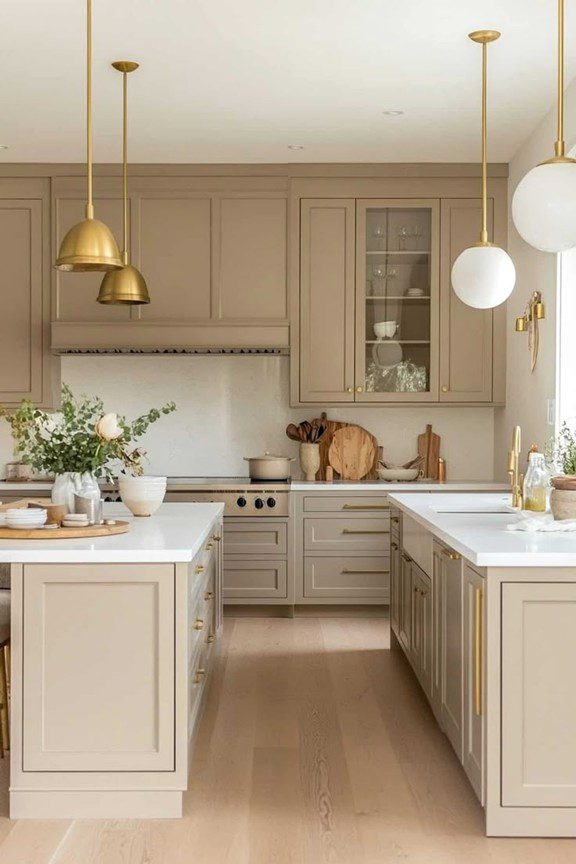
If there is a single overarching narrative in Ontario kitchen colour trends right now, it is the triumph of warm neutrals. Industry surveys confirm that neutrals remain the top colour category — with approximately 96% of design professionals still ranking them as the primary choice for kitchen cabinetry. But the definition of ‘neutral’ has shifted dramatically.
Gone is the cool grey-dominated neutral palette that characterised kitchens from roughly 2012 to 2022. Today’s leading neutrals in Ontario draw from a warmer, earthier spectrum:
- Mushroom: A muted, brownish-grey with warm undertones that pairs beautifully with wood and stone
- Taupe: Endlessly versatile, taupe bridges beige and grey with a sophistication that suits both contemporary and transitional kitchens
- Greige: Cooler than taupe but warmer than grey, greige remains a staple for homeowners seeking balance
- Sand and soft clay: Earth-toned neutrals that connect the kitchen palette to the natural world
- Warm putty: A soft, almost skin-like tone that reads as quiet luxury
These warm neutrals are particularly effective in Ontario homes because of the province’s climate. During the long grey winters, a kitchen in warm mushroom or soft taupe with abundance of wood grain detail creates a sense of hygge — a cosy, convivial atmosphere that cold-grey kitchens simply cannot achieve.
From a design perspective, warm neutrals also offer extraordinary flexibility. They work equally well with black, brass, brushed nickel, or bronze hardware. They complement both light and dark wood tones. And they age gracefully — an important consideration given the significant investment a kitchen renovation represents.
See More White Single Shaker (WSS)
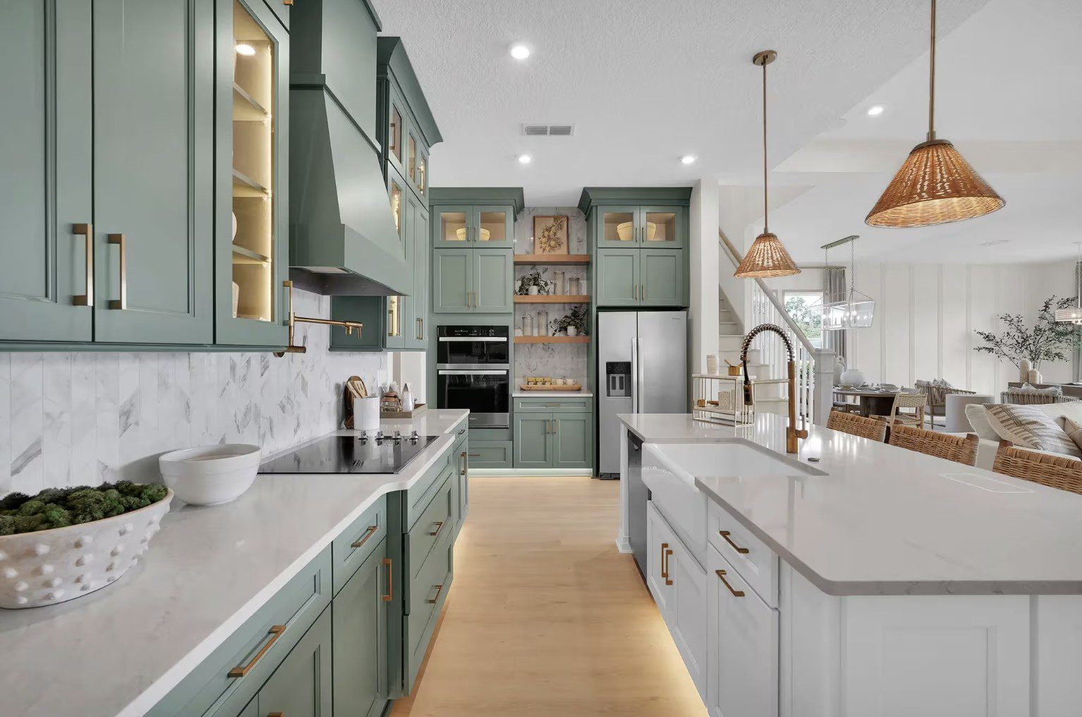
3. Sage Green and Nature-Inspired Greens: Ontario’s Most-Requested Colour
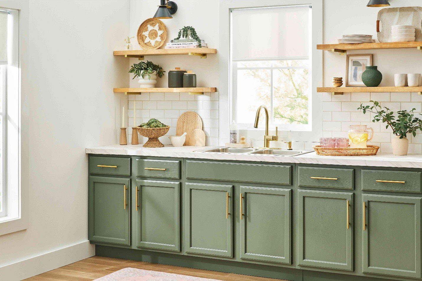
Ask any Ontario kitchen designer what colour clients are requesting most right now, and the answer is almost universally green. Specifically, the muted, sophisticated greens drawn from the natural landscape: sage, eucalyptus, thyme, moss, and soft olive.
The green kitchen trend is not new — it gained momentum around 2022 — but it has matured considerably. Early green kitchens often leaned toward bright, saturated shades. Today’s Ontario homeowners are choosing deeper, more complex greens that feel more anchored and less trend-chasing.
The Green Spectrum: Choosing the Right Shade
- Sage green: The most popular choice. Soft, grey-green with a dusty finish. Works in almost any size kitchen and pairs with virtually any countertop material.
- Moss green: Slightly darker and more yellow-toned than sage. Particularly effective for kitchen islands or lower cabinets paired with cream uppers.
- Olive green: Warm and complex, with brownish undertones that complement wood grains and warm metals beautifully.
- Forest green: Bold and dramatic. Best used on a single feature element — an island, a bank of lower cabinets, or a pantry unit — rather than throughout.
- Deep teal: Straddles the boundary between green and blue. A strong choice for islands or base modules where rhythm and depth are desired.
Green resonates particularly strongly in Ontario’s design culture because it connects interior spaces to the province’s extraordinary natural landscape — from the forests of Muskoka to the Niagara Escarpment. Homeowners in Burlington, Oakville, and other communities close to the Greenbelt are especially drawn to nature-referencing palettes.
From a technical standpoint, muted greens pair beautifully with aged brass or brushed copper hardware, warm-toned wood shelving, and natural stone countertops in creamy beige or white with soft veining. Wall paint in light greige or warm cream creates a harmonious frame for green cabinetry.
| Designer Data Point
According to NKBA’s 2025 Kitchen Trends Report, green is the most popular kitchen colour chosen by 76% of design professionals — making it the runaway leader over all other colour categories for the second consecutive year. |
See More: Best Kitchen Colours for Condos & Rentals
4. Deep Blues: Timeless Sophistication for Ontario Kitchens
Blue has been a credible kitchen colour in Ontario for several years, and its appeal shows no signs of diminishing. What has changed is the specific shades gaining traction. The light, airy navy and powder blues of earlier trends have given way to richer, more complex blues with depth and gravitas.
- Midnight blue: A near-black blue with tremendous presence. Particularly effective in larger Ontario kitchens where it anchors the space without feeling oppressive.
- Indigo: Slightly warmer than midnight blue, with subtle purple undertones that pair beautifully with warm wood and brass.
- Prussian blue: The jewel-toned, sophisticated sibling of navy. Dramatic and timeless.
- Coastal navy: For Toronto homeowners looking toward the lake, softer navy shades evoke the water without feeling nautical.
- Dusty blue-grey: A softer option that sits between grey and blue, offering colour without commitment — ideal for cautious buyers.
Deep blue kitchens photograph exceptionally well, which matters in Ontario’s active real estate market. A midnight blue island against creamy upper cabinets is one of the most frequently photographed kitchen configurations in GTA renovation portfolios — a reliable signal of both current taste and lasting appeal.
Hardware pairings for deep blue cabinetry follow a clear hierarchy: brass and unlacquered brass remain the dominant choice, offering a warm contrast that flatters the cool depth of dark blue. Matte black is a sleeker, more contemporary alternative. Brushed nickel can look cold against very dark blues and is generally best avoided.
See More Blue Single Shaker (BSS)
5. Earthy and Terracotta Tones: Ontario’s Rising Colour Story
One of the most significant emerging colour trends in Ontario kitchens for 2026 is the rise of warm terracotta, clay, and rust-toned cabinetry. These earth-derived colours represent a departure from the cooler, more cerebral tones that dominated the previous decade — and they are resonating strongly with Ontario homeowners seeking spaces that feel grounded, personal, and warm.
Terracotta and related earth tones work especially well in transitional and farmhouse-style kitchens. They pair naturally with exposed wood beams, handmade ceramic tiles, unlacquered brass fixtures, and linen textiles — creating kitchens that feel genuinely artisanal rather than mass-produced.
- Terracotta: The most iconic earth tone. Best used on lower cabinets or an island, balanced with cream or warm white uppers.
- Burnt sienna: A deeper, more complex version of terracotta with reddish-brown undertones.
- Warm clay: A dusty, muted terracotta that is approachable and less risky than deeper rust shades.
- Ochre-influenced neutrals: Yellow-orange neutrals with clay undertones that work beautifully in south-facing Ontario kitchens that receive strong afternoon light.
It is worth noting that terracotta is not a new trend — it is a return. These colours dominated home interiors in the 1970s and early 1980s, and their return represents a broader cultural shift toward comfort, authenticity, and rejection of hyper-minimalist sterility.
View Full Kitchen Cabinet Collection
6. Rich Reds and Burgundy: The Bold Statement for 2026
For Ontario homeowners with confidence and commitment, rich reds are making a compelling case for the kitchen in 2026. These are not the bright, primary reds of decades past — they are deep, wine-inspired tones: burgundy, oxblood, merlot, and Bordeaux-adjacent shades that bring sophistication and warmth to any kitchen.
Used thoughtfully — on a single island, a tall larder cabinet, or a bank of lower units — deep reds create an extraordinary sense of depth and maturity. They signal that the homeowner has made a deliberate, confident design choice rather than following the safest available path.
The key to making red work in an Ontario kitchen is restraint and partnership. Rich red cabinetry should be balanced with warm neutrals or creamy whites. Hardware in unlacquered brass, aged brass, or brushed bronze enhances the luxurious quality of deep reds. Countertops in warm-toned marble, honed limestone, or pale wood add necessary lightness.
| Colour Expert Perspective
Deep, brown-based reds like burgundy and oxblood are rising steadily across kitchen design and are no longer confined to seasonal interiors. Their growing popularity signals longevity rather than a passing moment — rich reds create warmth, depth, and cosiness that work particularly well in kitchens. |
See More: Top 99+ Most Beautiful and Modern Kitchen Cabinet Designs
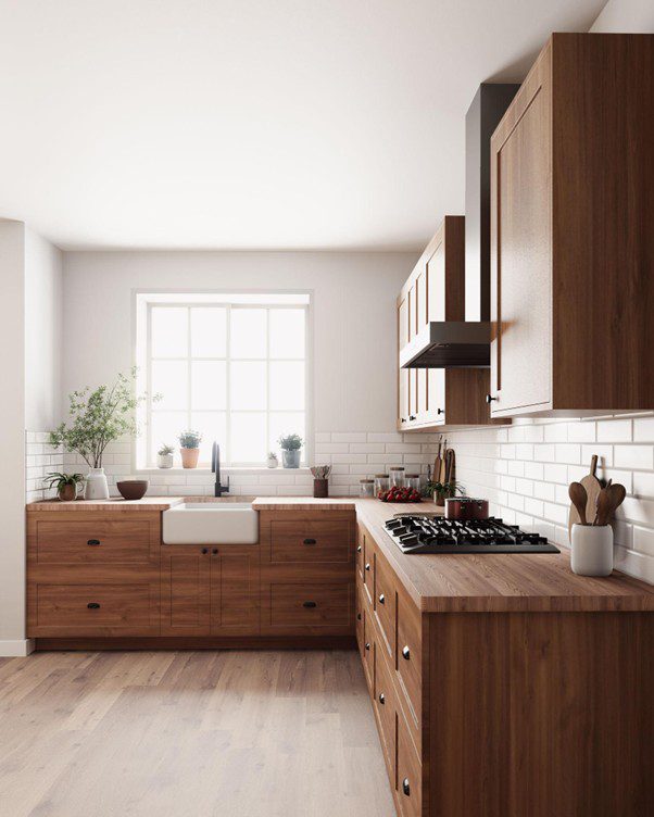
7. Wood Tones: The Natural ‘Colour’ Dominating Ontario Kitchens
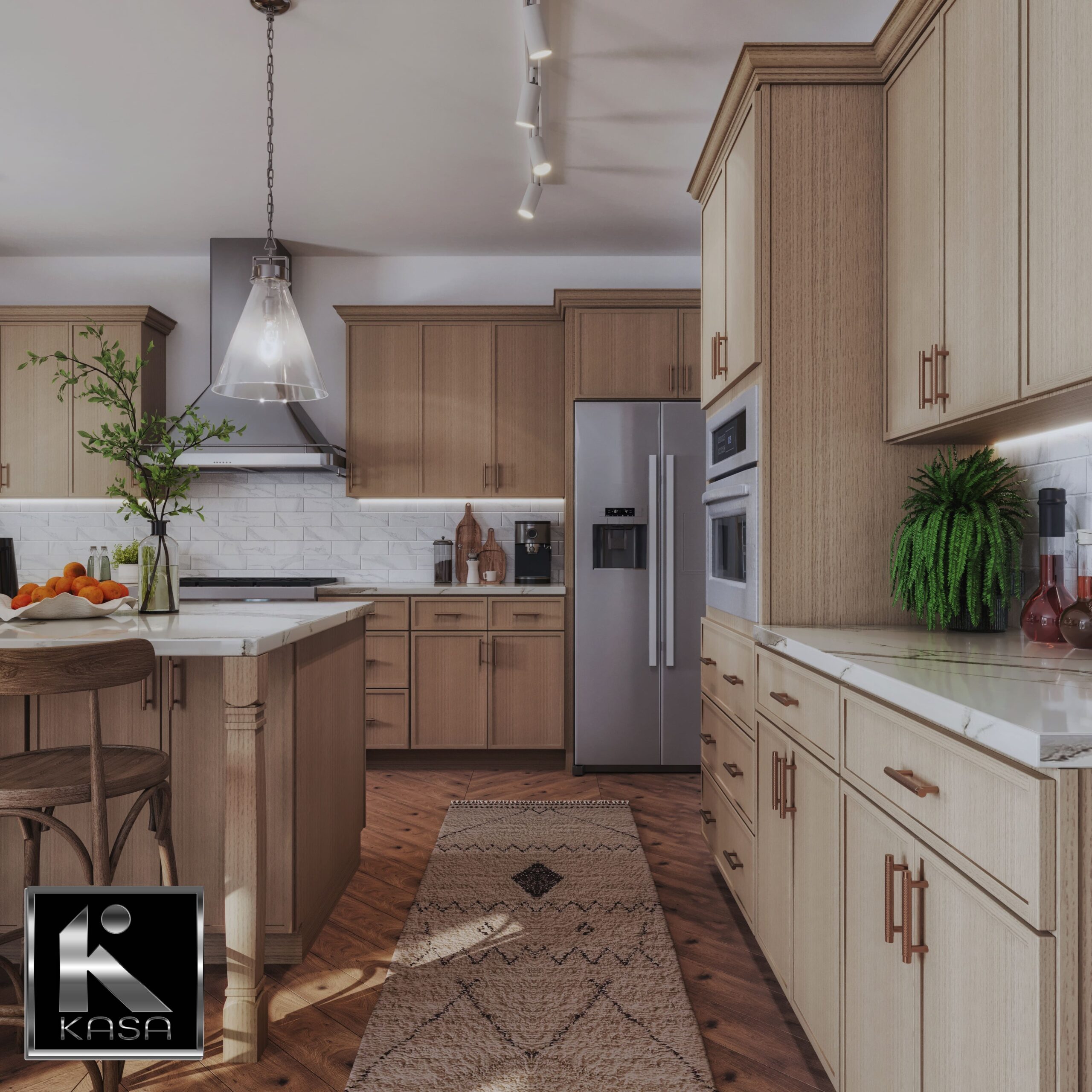
Any honest discussion of kitchen colour trends in Ontario must address wood — because natural wood grain finishes have overtaken painted cabinetry as the most in-demand option among the province’s design-forward homeowners.
Industry professionals across Ontario report a significant increase in demand for wood-grain finishes over painted finishes, with white oak the most commonly requested species, followed by walnut for the depth and contrast it offers. Homeowners specifically want to see the grain patterns and feel the texture — they are actively rejecting the decades-long trend of hiding wood’s natural character.
Popular Wood Species in Ontario Kitchens
- White oak: Clean, contemporary grain with a warm blonde tone. The current leader in Ontario design studios.
- Walnut: Deep brown with rich, complex grain. Pairs powerfully with creamy white or warm greige painted uppers.
- Cerused oak: White-washed or lime-washed oak that lightens the tone while preserving texture.
- Maple: Lighter and more uniform than oak, with a fine grain — popular for sleeker, Scandinavian-influenced kitchens.
- Bamboo: Increasingly popular for its sustainability credentials alongside its warm, clean appearance.
The trend toward exposed wood also intersects with the broader move toward matte finishes. Satin and matte lacquer on wood cabinetry resist fingerprints and scratches while enhancing the material’s natural warmth — a practical benefit that Ontario families with young children particularly appreciate.
See More: How to Choose the Right Kitchen Cabinets for Canadian Kitchens
8. Two-Tone Kitchens: Ontario’s Most Versatile Colour Strategy
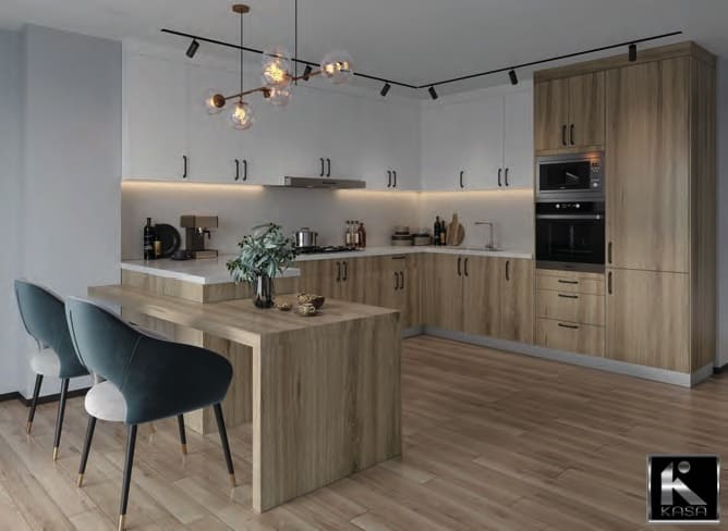
Rather than committing a single colour throughout, an increasing number of Ontario homeowners are embracing the two-tone kitchen — pairing a darker, more characterful colour on lower cabinets with a lighter tone on upper cabinets and walls. This approach offers the best of both worlds: personality and visual interest below, airiness and light above.
The most popular two-tone combinations appearing in Ontario kitchen renovations currently include:
- Sage green lowers with cream or soft white uppers
- Deep navy island with warm greige perimeter cabinets
- Walnut wood lowers with painted cream or warm white uppers
- Forest green or teal island paired with warm neutral surrounds
- Burgundy or terracotta island with soft taupe or linen uppers
Two-tone strategies also offer a financially smart approach to renovating: homeowners can update the character of a kitchen by repainting or replacing only the lower or island cabinetry, reducing cost and disruption while maximising visual impact.
9. How to Choose the Right Kitchen Colour for Your Ontario Home
Trend awareness is valuable — but it is only one input in your colour decision. The right kitchen colour for your home depends on a combination of factors specific to your situation:
Consider Your Home’s Architecture and Era
A Victorian semi in Toronto’s east end calls for different colours than a contemporary detached home in Oakville or a 1960s bungalow in Hamilton. Period-appropriate palettes — or thoughtful, deliberate contrasts to them — will always serve better than imported trends that clash with the underlying architecture.
Evaluate Your Natural Light
Ontario’s northern latitude means natural light quality varies significantly by orientation and season. North-facing kitchens benefit from warm colours that counteract grey light. South-facing kitchens can handle cooler tones without feeling cold. West-facing kitchens glow beautifully at sunset — but can feel dull in the morning.
Think About Your Kitchen’s Role
Is your kitchen a high-traffic family hub, or a sophisticated entertaining space? Family-focused kitchens benefit from durable, forgiving colours — warm neutrals, mid-tone greens, natural wood. Entertaining kitchens can afford more dramatic, statement-making colours.
Plan for Longevity
Kitchens are significant investments that Ontario homeowners typically live with for 15 to 25 years. Choose colours you genuinely love — not just what is trending today. The most enduring kitchen colours are those that feel both current and rooted in broader design history: warm neutrals, natural greens, deep blues, and honest wood tones all meet this test.
10. Colours to Reconsider: What Is Fading in Ontario Kitchens
Being informed about colour trends also means recognising which palettes are losing momentum — so you avoid completing a renovation that already feels dated before it is finished.
- Stark, cool grey: The dominant kitchen colour of 2013–2021 is now widely associated with dated design. Cool, blue-toned greys that were once ultramodern now read as tired.
- All-white kitchens: While warm whites remain strong, the clinical, high-contrast all-white kitchen with bright white everything feels increasingly sterile in 2025–2026.
- High-gloss finishes throughout: Reflective gloss cabinetry that was popular in the 2010s has been substantially replaced by matte and satin finishes.
- Mismatched cool and warm tones: The arbitrary pairing of cool grey cabinets with warm wood floors — common in renovations of the mid-2010s — now reads as a design disconnect.
Frequently Asked Questions
What is the most popular kitchen cabinet colour in Ontario right now?
Warm neutrals — including soft taupe, greige, warm cream, and mushroom — remain the most consistently popular category. Within accent and character colours, sage and muted greens are the single most requested shade, followed by deep blues and natural wood finishes.
Should I follow kitchen colour trends when renovating?
Trends are useful reference points, but they should be one input among several — alongside your home’s architecture, your personal taste, your available natural light, and the expected lifespan of your renovation. The most successful kitchen colour choices are those that feel both current and personally authentic.
How do two-tone kitchens work in Ontario homes?
Two-tone kitchens pair different colours or finishes on upper and lower cabinets. The most common approach uses a lighter, more neutral tone on uppers (which are seen against walls and near ceilings) and a richer, more characterful colour on lower cabinets and islands. This strategy creates depth and personality while maintaining visual balance.
How do I choose a kitchen colour that will not date quickly?
Prioritise colours with roots in broader design history — warm neutrals, natural earth tones, deep jewel shades, and natural wood finishes have all demonstrated multi-decade resilience. Avoid colours that are primarily a social-media moment with no deeper design tradition behind them. When in doubt, consult with a professional kitchen designer before committing.
Does kitchen colour affect home resale value in Ontario?
Yes, significantly. Ontario real estate agents consistently report that well-chosen kitchen colours — particularly contemporary warm neutrals and classic deep blues or greens — contribute positively to buyer perception and, by extension, sale prices. Highly personalised or unusual colour choices can restrict your buyer pool.
Conclusion: Ontario Kitchen Colours in 2026
The kitchen colour landscape in Ontario in 2025–2026 is richer, warmer, and more nuanced than at any point in the past decade. The clinical white kitchen has given way to a more considered, personality-driven approach — one that draws on nature, history, and individual character rather than a single dominant aesthetic.
Whether you are drawn to the quiet sophistication of warm cashmere neutrals, the nature-connected beauty of sage and moss greens, the classic depth of navy and deep blue, the artisanal warmth of terracotta and earth tones, or the bold confidence of rich burgundy and deep red — there has never been a better time to invest in a kitchen that truly reflects who you are.
The colours you choose will set the emotional tone of your home’s most important room for years to come. Take the time to choose thoughtfully, test extensively, and work with professionals who understand both the trends and the timeless principles that underpin lasting kitchen design.
| Ready to Transform Your Kitchen?
Work with the experts at KASA Kitchens — Ontario’s trusted custom kitchen design and renovation specialists serving the Greater Toronto Area and beyond. |