


Blog
Two-Tone Kitchen Cabinets: How to Mix Colors Without It Looking Busy
Sep
Two-tone kitchen cabinets have become one of the most requested design choices in Canadian kitchens over the past few years. Homeowners like the idea of combining two colors because it adds depth and personality to a room that used to be finished in a single, flat shade. The challenge is that mixing colors is easy to get wrong. Too many colors, the wrong proportions, or poor placement can turn a kitchen into a cluttered, uneven space instead of a balanced, designer looking one.
This guide breaks down the practical rules that interior designers and cabinet makers actually use when planning a two-tone kitchen. It covers color pairing, placement, hardware, countertops, and the most common mistakes homeowners make. The goal is to give you a clear framework so you can plan a two-tone kitchen that feels intentional, not chaotic.
What Are Two-Tone Kitchen Cabinets
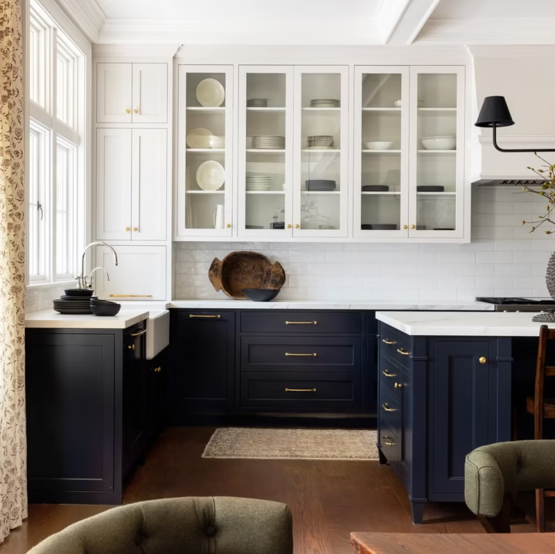
A two-tone kitchen simply means the cabinetry uses two different colors or finishes instead of one uniform color throughout. This is different from mixing random accent pieces here and there. In a well designed two-tone kitchen, the color split follows a clear pattern, usually based on cabinet height, function, or location in the room.
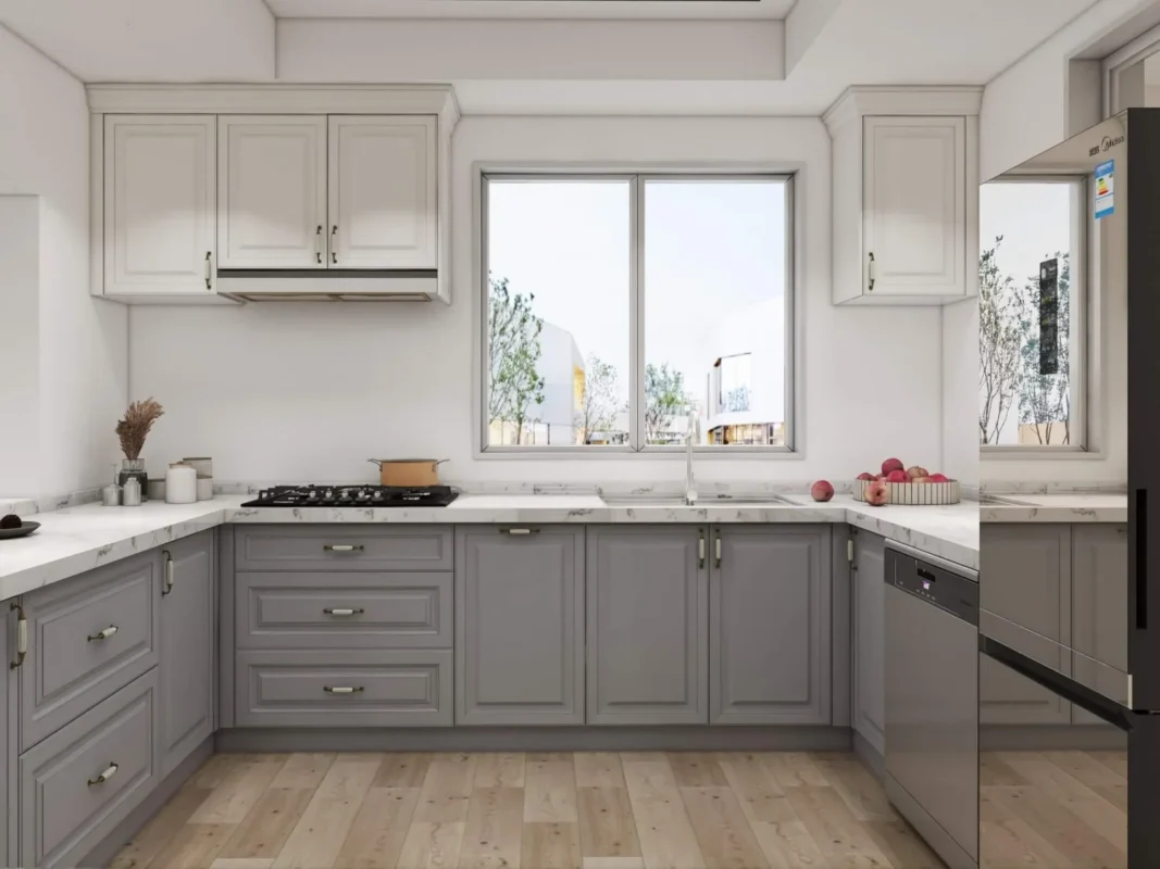
Common patterns include a different color for the island versus the perimeter cabinets, a different color for upper cabinets versus lower cabinets, or a contrast between a wall of open shelving and the main cabinet run. Each of these approaches can work well, but they need to follow a consistent logic so the eye can read the space easily.
Why Two-Tone Cabinets Are Popular in Canadian Kitchens Right Now
Kitchen renovation trends across Canada have moved away from the all white kitchens that dominated the last decade. Homeowners in cities like Toronto, Vancouver, and Calgary are increasingly asking for cabinetry that feels warmer and more personal, without going as bold as a fully colored kitchen.
Two-tone cabinets offer a middle ground. They let homeowners introduce a darker, richer color such as navy, forest green, or charcoal in one part of the kitchen while keeping the rest of the space light and neutral. This approach also tends to age better than an all trend driven color scheme, since the neutral base stays flexible while the accent tone can be updated more easily during a future refresh.
There is also a practical, resale focused reason many homeowners choose this route. A kitchen that leans too heavily into one strong color can limit buyer appeal. A two-tone kitchen with a neutral majority and a smart accent color tends to photograph well and appeal to a broader range of tastes, which matters in competitive housing markets across Canada.
The Core Rule: One Dominant Color, One Supporting Color
The single most important rule in two-tone cabinet design is proportion. A kitchen should have one dominant color that covers the majority of the cabinetry, roughly sixty to seventy percent of the visible cabinet surface, and one supporting color used more sparingly for the remaining portion.
When designers say a two-tone kitchen looks busy, they usually mean the color split is close to fifty fifty, or that a third or fourth color has been added without a clear reason. The eye needs a clear anchor point. If every wall competes for attention, the kitchen feels unsettled even if the individual colors are attractive on their own.
A simple way to plan this is to pick the color for your largest surface area first, usually the perimeter cabinets, then choose a second color only for a specific, contained zone such as the island, a bank of lower cabinets, or a feature wall unit.
Best Two-Tone Color Combinations for Canadian Homes
The right combination depends on the amount of natural light in the kitchen, the overall style of the home, and personal preference, but a few pairings consistently work well in Canadian interiors.
- White or off white perimeter with a navy or deep blue island. This is one of the most requested combinations and works in both traditional and modern kitchens.
- Warm wood tone perimeter with black or charcoal accents. This pairing suits homes with a more contemporary or Scandinavian inspired look.
- Soft gray perimeter with sage or forest green lower cabinets. This combination has grown in popularity in kitchens with a lot of natural light.
- Cream or warm white uppers with a rich terracotta or clay tone on the island. This works well in homes aiming for a warmer, more layered palette.
- Two shades of the same color family, such as a light gray upper and a charcoal lower. This is the safest option for homeowners who want contrast without a strong color statement.
See more:
5 Smart Kitchen Cabinet Layouts That Maximize Space in Canadian Condos
Where to Place Each Color for the Best Result
Placement matters as much as color choice. A few placement principles tend to hold up across most kitchen layouts.
- Keep upper cabinets lighter. Lighter uppers reflect more light and keep the ceiling area feeling open, which is especially useful in kitchens with standard eight foot ceilings common in many Canadian homes.
- Use the darker or bolder color on the lower cabinets or island. This grounds the room visually and draws the eye downward, which balances the lighter upper cabinets.
- If the kitchen has a peninsula or island, treat it as its own zone. Giving the island a distinct color naturally creates a focal point without needing to change colors throughout the rest of the kitchen.
- Avoid switching colors mid wall. A color change should happen at a natural break point, such as where a run of cabinets ends or where the island separates from the main counter run, not in the middle of a continuous cabinet run.
Common Mistakes That Make a Two-Tone Kitchen Look Busy
Most two-tone kitchens that feel overwhelming share a few recurring problems.
- Using colors with similar visual weight everywhere, so nothing reads as the primary or secondary tone.
- Adding a third finish, such as a wood accent, on top of two painted colors without planning how all three interact.
- Choosing high contrast hardware finishes for both cabinet colors at once, which adds another layer of visual noise.
- Pairing two colors with clashing undertones, for example a cool toned gray next to a warm toned beige, which can make the kitchen feel unresolved even if each color looks fine in isolation.
- Ignoring the backsplash and countertop when planning the cabinet colors, resulting in a kitchen where every surface is trying to be the star of the room.
Choosing Hardware and Countertops for a Two-Tone Kitchen
Hardware and countertops act as the connective tissue between two cabinet colors, so they deserve as much planning as the paint or finish selection itself.
For hardware, a single consistent finish across both cabinet colors, such as brushed brass, matte black, or brushed nickel, usually looks more cohesive than switching hardware finishes to match each cabinet color. This keeps the two tone effect from feeling like two separate kitchens pushed together.
For countertops, a neutral stone or quartz with subtle veining tends to work best because it can visually bridge both cabinet colors. Choosing a countertop that echoes an undertone from either the dominant or accent cabinet color, rather than matching either one exactly, tends to create the most balanced result.
Two-Tone Cabinets in Small Kitchens Versus Large Kitchens
Kitchen size affects how bold a two-tone scheme can be. In smaller kitchens, which are common in condos and older homes across many Canadian cities, it is usually safer to keep the contrast between the two colors moderate rather than dramatic. A small kitchen with a very dark lower cabinet color and a stark white upper can feel choppy in a compact space. A softer contrast, such as warm white paired with a muted sage or soft taupe, tends to keep a small kitchen feeling open.
In larger kitchens, there is more room to introduce a bolder contrast, such as a deep navy or black island against lighter perimeter cabinetry, because there is enough visual space for the eye to separate the two zones comfortably.
Why Working with an Experienced Kitchen Designer Matters
Two-tone cabinetry looks simple in photos, but getting the proportions, undertones, and placement right in an actual space takes experience. A color pairing that looks balanced in a showroom or on a design app can behave differently once it is applied to your specific cabinet layout, lighting conditions, and adjoining finishes.
An experienced kitchen design and cabinetry team can test color samples against your actual lighting, guide you on proportion so the space does not feel busy, and help coordinate hardware, countertops, and backsplash so every element works together rather than competing for attention. This is where working with a dedicated kitchen specialist, rather than guessing from inspiration photos alone, tends to save both time and costly reselection later in the renovation.
How to Test Two-Tone Color Combinations Before You Commit
Paint chips and online mood boards rarely show how a color will actually behave in your kitchen. Lighting changes throughout the day, and the fixtures, flooring, and window placement in your home will all shift how a color reads compared to how it looked in a showroom or on a screen.
Before finalizing a two-tone scheme, order large sample boards or door fronts in both proposed colors and place them where the cabinets will actually sit. View them in the morning, at midday, and in the evening under your kitchen lighting, since a color that looks balanced under bright daylight can look muddy or flat under warm evening light. It also helps to hold the two samples together at the proportion you plan to use, rather than viewing them side by side at equal size, since this gives a more accurate sense of how the finished kitchen will feel.
If your home has a lot of north facing light, colors tend to read cooler and slightly grayer, so warmer undertones can help balance the space. South and west facing kitchens get warmer, more golden light, which can make cool toned grays and blues appear more vivid than expected. Testing samples in your own kitchen, rather than relying on how a combination looks in someone else’s renovation photos, is one of the most reliable ways to avoid a mismatch after installation.
How Two-Tone Cabinets Affect Kitchen Resale Value
For homeowners planning a renovation with resale in mind, color choice is not just an aesthetic decision, it is also a financial one. Real estate agents across Canada frequently note that kitchens with a neutral majority color and a tasteful accent tend to appeal to a wider pool of buyers than kitchens finished entirely in a bold, trend driven color.
A two-tone kitchen with a light, neutral perimeter and a contained accent color, such as a navy or sage island, tends to strike a good balance between personality and broad appeal. It signals an updated, considered renovation without limiting the kitchen to a narrow style preference. If resale is a priority, it is often worth keeping the accent color confined to a single, easily repaintable element such as an island, rather than spreading a bold color across multiple walls of cabinetry.
Plan Your Two-Tone Kitchen with KASA Kitchens
Choosing the right color pairing, proportion, and hardware for a two-tone kitchen is easier with an experienced team guiding the decisions. KASA Kitchens works with homeowners across Canada to design custom and semi custom cabinetry that fits the scale and light of each individual kitchen, from color selection through final installation.
If you are planning a kitchen renovation and want a two-tone design that feels balanced rather than busy, reach out to KASA Kitchens to book a consultation and see color and cabinet samples in person before you commit
