


Blog
How to Choose the Right Kitchen Colour for Small Spaces
Mar
Choosing the right kitchen colour for small spaces is one of the most impactful decisions you can make when decorating a compact home. The wrong palette can make an already tight kitchen feel cramped and dark, while the right colours can visually expand the space, boost natural light, and create a welcoming atmosphere.
In this guide, we will explore proven colour strategies used by interior designers to transform small kitchens into stylish, functional spaces — without knocking down a single wall.
1. Why Colour Matters More in Small Kitchens
In larger kitchens, colour is a design choice. In small kitchens, it is a spatial tool. The human eye perceives light colours as receding and dark colours as advancing, meaning the palette you choose directly affects how spacious your kitchen appears.
Key reasons colour matters in compact spaces:
- Light shades reflect natural and artificial light, making the room feel airy.
- Dark tones absorb light and can create a cosy but potentially claustrophobic effect.
- Colour continuity between walls, cabinets, and countertops reduces visual interruptions and creates a seamless, expansive feel.
- Accent colours can draw the eye upward, making ceilings appear higher.
2. Best Colour Choices for Small Kitchens
Selecting the right colour palette can transform a compact kitchen from cramped and shadowy to bright and inviting. The key is understanding how undertones, lighting conditions, and material finishes interact with each shade. Below is a deeper look at the most effective colour families for small kitchens — and how to use them strategically.
a) Crisp White & Off-White
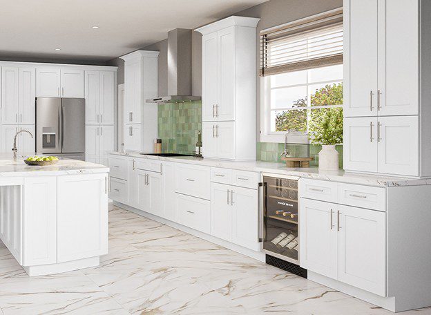
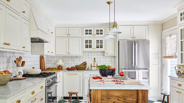
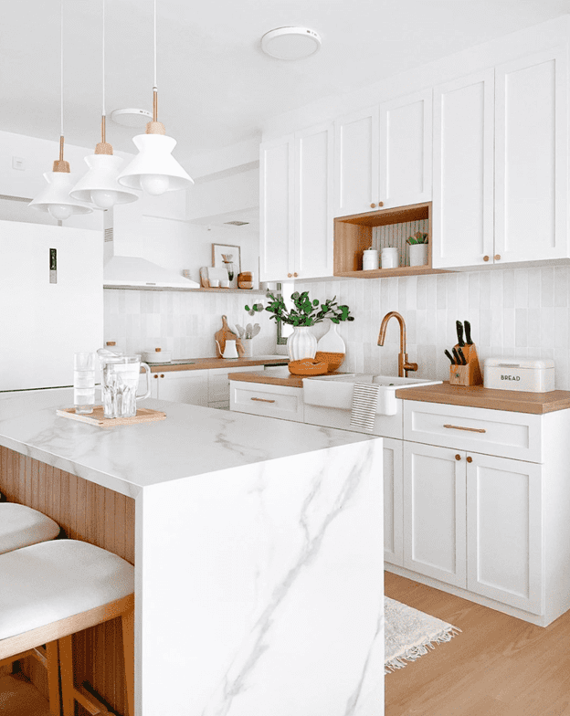
White continues to be the most reliable colour for visually expanding a small kitchen. Its high light reflectance value (LRV) allows it to bounce both natural and artificial light throughout the space, minimizing shadows and dark corners. This creates a cleaner, more open feel even in kitchens with limited square footage.
However, not all whites are the same.
- Cool whites (with blue or grey undertones) feel crisp and modern.
- Warm whites (with cream or yellow undertones) feel softer and more inviting.
- Ivory and cream tones add subtle depth while maintaining brightness.
Choosing the right undertone is essential. In north-facing kitchens with cooler daylight, warmer whites prevent the room from feeling sterile. In south-facing kitchens with strong sunlight, cooler whites can balance excessive warmth.
Pro Tip: Use similar white tones for cabinets, walls, and trim to eliminate visual breaks. When the eye does not encounter strong contrast lines, the space appears larger and more seamless.
See More: Top 99+ Most Beautiful and Modern Kitchen Cabinet Designs
b) Soft Neutrals (Greige, Beige, Light Grey)
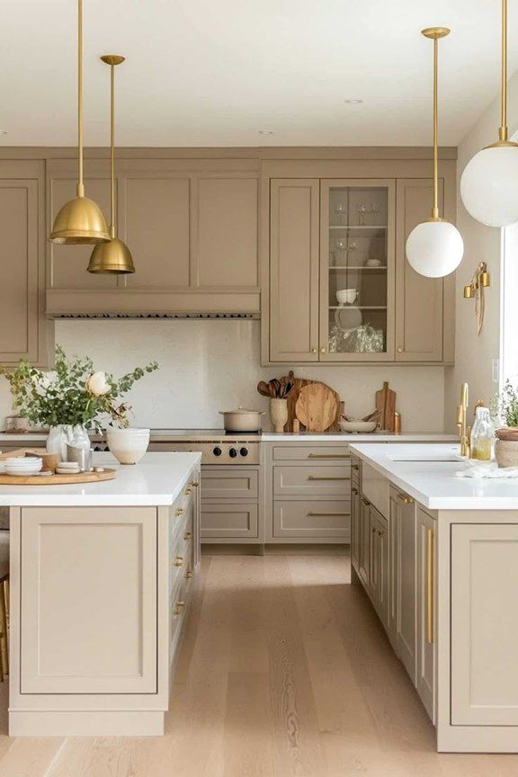
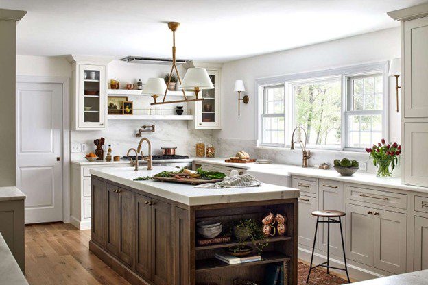
Soft neutrals provide subtle warmth while preserving an airy atmosphere. These tones are ideal if you want more personality than white but still need visual openness.
Greige, a blend of grey and beige, has become especially popular because it adapts well to different lighting conditions. It pairs beautifully with:
- Natural wood countertops or open shelving
- Stainless steel appliances
- Matte black or brushed gold hardware
- Both warm and cool LED lighting
Light grey offers a modern, minimalist feel, while beige introduces a comforting, organic tone. The key is to avoid deep or muddy neutrals in small kitchens, as they can absorb light and reduce perceived space.
For best results, maintain tonal consistency between cabinetry, backsplash, and wall paint to prevent heavy contrast.
See More: How to Choose the Right Kitchen Cabinets for Canadian Kitchens
c) Pale Blues and Soft Greens
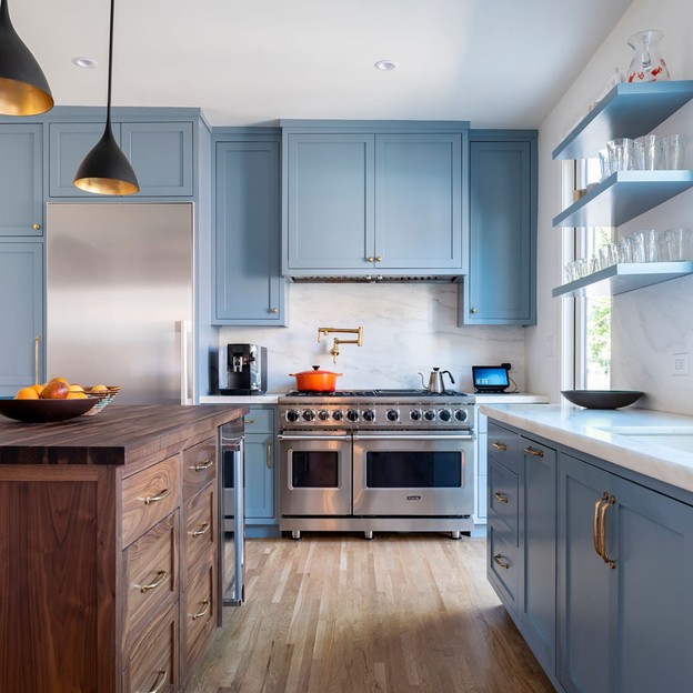
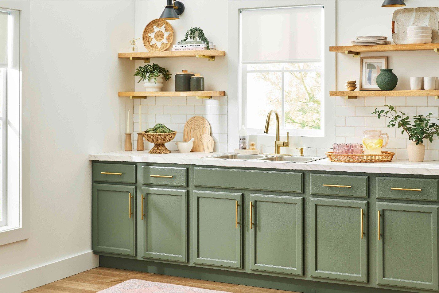
Cool pastel tones bring freshness and visual lightness to compact kitchens. Pale blue, duck egg, sage green, and mint evoke natural elements — sky, sea, and foliage — which psychologically expand a room by connecting it to the outdoors.
These shades work particularly well in kitchens that:
- Lack strong natural sunlight
- Need a calming, relaxed atmosphere
- Feature light wood flooring or white countertops
Sage green has gained popularity for its versatility; it pairs equally well with brass hardware for warmth or chrome finishes for a modern look.
Because these colours are muted rather than saturated, they add character without overpowering the room.
d) Light Yellow and Warm Pastels
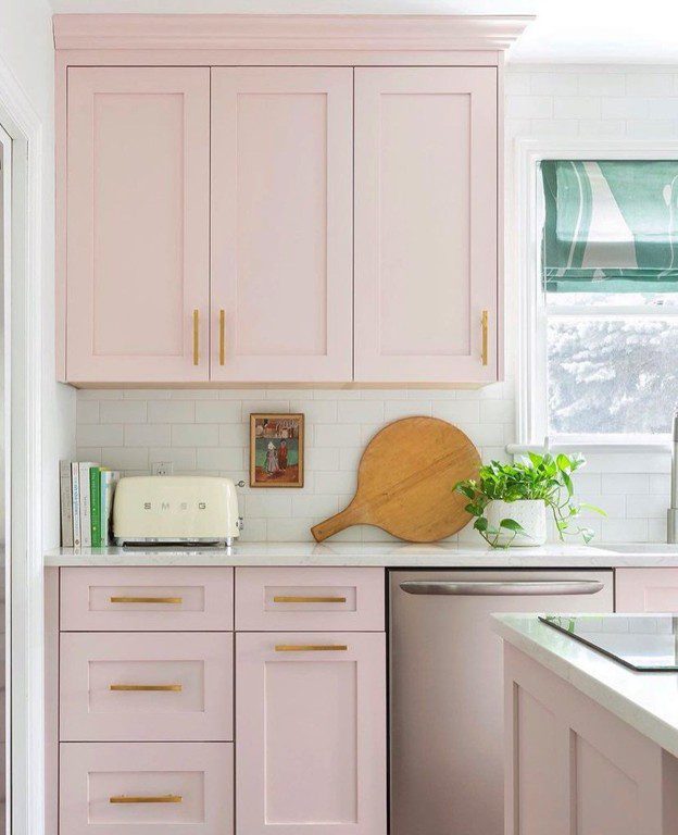
Warm pastels introduce personality while maintaining brightness. Pale yellow can subtly mimic sunlight, making windowless kitchens feel more cheerful. Peach and blush tones add softness without visually shrinking the space.
To ensure success with warm pastels:
- Keep ceilings and trim white to maintain crisp contrast.
- Pair with light wood or pale stone flooring to preserve openness.
- Avoid pairing with dark countertops, which may visually “cut” the room in half.
When applied thoughtfully, warm pastels create a welcoming environment that feels intimate rather than confined.
e) Strategic Use of Dark Colours
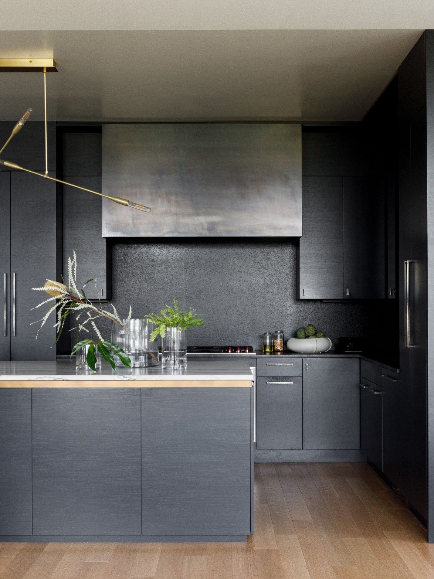
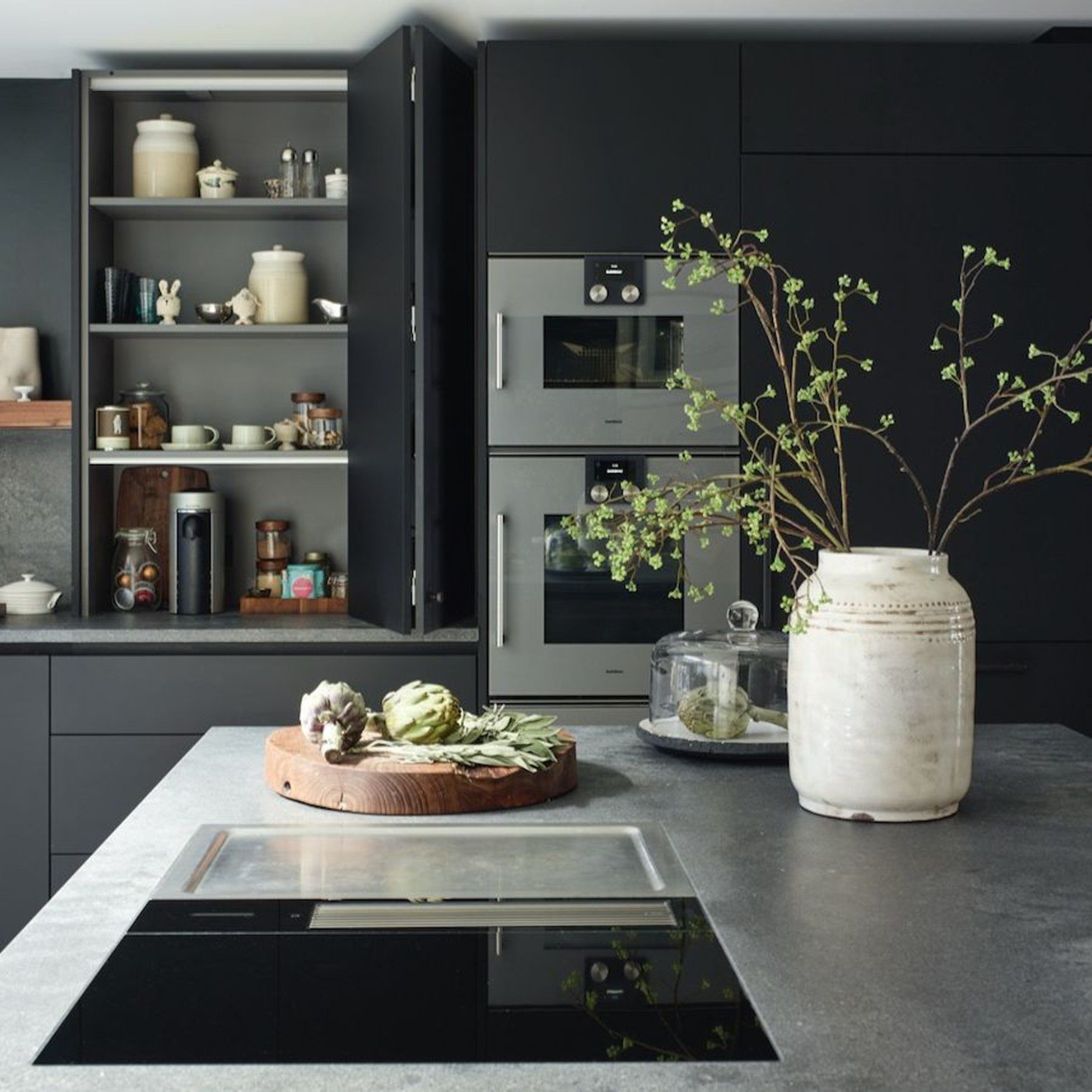
Dark colours are not off-limits in small kitchens — they simply require balance. Deep navy, forest green, or charcoal can add sophistication and depth when used strategically.
The most effective method is a two-tone approach:
- Darker lower cabinets or kitchen island
- Light upper cabinets and walls
This technique grounds the space visually while keeping the upper half bright and open. The darker base adds contrast and architectural interest without overwhelming the room.
To prevent heaviness, ensure there is sufficient lighting — under-cabinet LEDs, reflective backsplashes, and light countertops help maintain balance.
See More: What Are Plywood Kitchen Cabinets? Are They Worth It?
3. Colours to Avoid in Small Kitchens
While there are no absolute rules, certain colour choices tend to work against you in compact kitchens:
- Very dark walls combined with dark cabinets: This doubles down on light absorption and can make the kitchen feel like a cave.
- High-contrast colour blocking: Bold contrasting panels create visual interruptions that break up the space.
- Overly bold accent walls: A bright red or deep purple wall in a small kitchen can feel overwhelming rather than striking.
- Busy patterns on large surfaces: Heavily patterned tiles or wallpaper on all surfaces can make a small kitchen feel chaotic.
4. Design Tricks to Amplify Your Colour Choice in a Small Kitchen
Choosing the right colour is only the first step. How you apply and enhance that colour through smart design strategies can dramatically influence how spacious your kitchen feels. Below are deeper, practical ways to maximize the visual impact of your colour palette.
Match Your Cabinets to Your Walls for Seamless Flow
When cabinets and walls share the same colour — or very close tonal variations — the room feels uninterrupted and cohesive. Visual breaks between contrasting colours create “edges” that define boundaries, making a space feel smaller. By minimizing these boundaries, you allow the eye to travel smoothly across the room, creating the illusion of expanded square footage.
For best results:
- Use a monochromatic scheme (for example, soft white walls with slightly warmer white cabinetry).
- If using grey or beige, keep undertones consistent to avoid subtle clashes.
- Consider painting crown moulding and trim the same shade to maintain continuity.
This approach works particularly well in galley kitchens or compact condo layouts where visual simplicity is essential.
Use Reflective and Glossy Finishes to Multiply Light
Light reflection plays a crucial role in spatial perception. Surfaces that bounce light around the room create brightness and depth, both of which make small kitchens feel larger.
Options to consider:
- High-gloss cabinet finishes that reflect natural and artificial light.
- Lacquered or acrylic cabinet doors for a sleek, mirror-like effect.
- Glossy ceramic or glass backsplash tiles.
- Quartz or polished stone countertops with subtle reflective qualities.
However, balance is key. Too many shiny surfaces can feel overwhelming. Pair glossy finishes with matte elements (such as matte walls or brushed metal hardware) to maintain warmth and visual comfort.
Embrace Vertical Lines to Enhance Perceived Height
In kitchens with low ceilings, colour alone cannot create height — but design direction can. Vertical elements guide the eye upward, visually stretching the room.
Effective strategies include:
- Installing full-height cabinets that reach the ceiling.
- Choosing vertically stacked subway tiles or elongated tile patterns.
- Incorporating vertical paneling or slim shaker-style cabinet doors.
- Adding vertical LED strip lighting along cabinet edges.
When paired with light colours, these vertical lines create a sense of airiness and architectural sophistication, even in compact spaces.
Incorporate Mirrors and Glass for Visual Depth
Glass and mirrored surfaces introduce depth by reflecting surrounding colours and light. This visual duplication tricks the brain into perceiving more space than physically exists.
Smart applications include:
- Glass-front upper cabinets to reduce visual heaviness.
- Mirrored or reflective splashbacks behind cooktops.
- Clear glass pendant lighting instead of solid fixtures.
- Open shelving with glass accessories to maintain transparency.
These elements are especially powerful in kitchens with limited natural light, as they help distribute brightness evenly across the space.
Choose Light-Coloured Flooring to Anchor the Room
Flooring often occupies a large visual area, yet it is frequently overlooked when planning colour schemes. A dark floor can visually “shrink” a kitchen by creating a heavy base, while lighter flooring extends the openness created by pale walls and cabinets.
Recommended options:
- Light oak or maple-toned engineered wood.
- Cream or soft beige porcelain tiles.
- White or pale grey stone.
To maximize impact, avoid strong colour contrasts between the floor and cabinetry. Instead, aim for gradual tonal transitions that create a seamless flow from floor to ceiling. This layered harmony enhances the illusion of spaciousness without making the room feel flat or sterile.
See More: What Are the Best Kitchen Cabinet Materials for Basement Kitchens in Canada?
5. How Lighting Interacts With Your Colour Choice
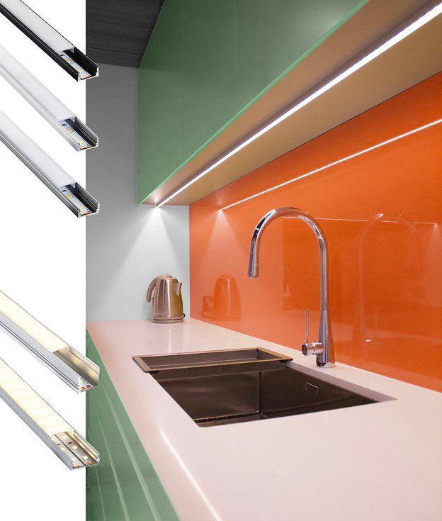
No colour strategy for a small kitchen is complete without understanding lighting. Light influences undertone, depth, warmth, and even how spacious a room feels. The exact same paint colour can appear crisp and airy in one kitchen — and dull or overly saturated in another — simply because of light direction and intensity.
Natural Light Direction
North-facing kitchens receive cooler, blue-toned daylight. This can make whites appear slightly grey and cool colours feel sharper. To balance this effect, choose warm neutrals such as cream, ivory, or greige. These tones soften the coolness and prevent the space from feeling clinical.
South-facing kitchens benefit from strong, golden sunlight throughout the day. Warm colours may intensify under this light, sometimes appearing more yellow or beige than expected. Cooler shades like pale blue, soft grey, or muted green tend to look balanced and fresh in these spaces.
East-facing kitchens receive warm morning light and cooler afternoon light. Mid-tone neutrals or balanced whites perform best here because they adapt more consistently throughout the day.
West-facing kitchens experience cooler mornings and warmer evenings. If you cook mostly at night, consider how artificial lighting will interact with your chosen colour during evening hours.
Artificial Lighting Matters Just as Much
Lighting temperature (measured in Kelvin) significantly impacts colour perception:
- 2700K–3000K (warm white): Enhances warm tones and creates a cozy atmosphere.
- 3500K–4000K (neutral to cool white): Brighter and more modern, ideal for contemporary kitchens.
- Above 4000K: Can make warm colours appear washed out and cool tones more intense.
LED under-cabinet lighting is especially powerful in small kitchens. It eliminates shadows on countertops and reflects light upward onto walls and cabinets, amplifying brightness and depth.
Pendant lights over islands or dining nooks draw the eye upward, creating vertical emphasis. This subtle visual trick shifts attention away from the room’s limited footprint and adds architectural interest.
Always Test Before Committing
Paint large sample boards and observe them:
- Morning and evening
- With natural light and artificial light on
- Against your cabinets, flooring, and countertops
Small paint chips are not enough. Colour is contextual, and lighting determines its true character.
See More: Are ¾” Plywood Cabinets Really Worth the Upgrade?
6. Colour Combinations That Work Brilliantly in Small Kitchens
Choosing a well-balanced palette is often more effective than selecting a single “perfect” colour. The following combinations are proven to enhance light, depth, and harmony in compact spaces.
Classic & Clean
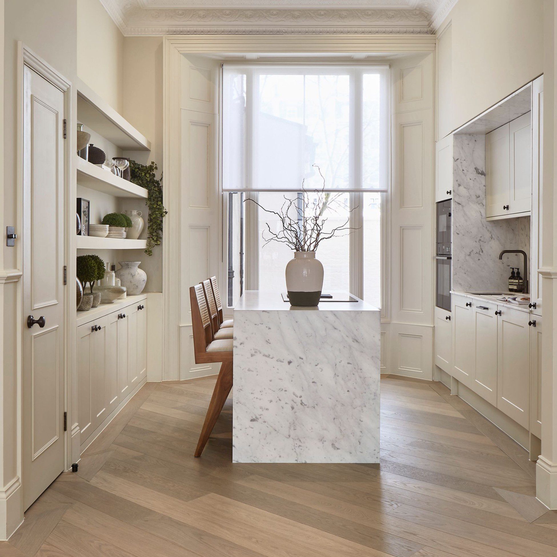
All-white cabinets + warm white walls + light oak flooring
This timeless combination maximizes brightness while the subtle warmth of oak prevents the space from feeling sterile. The layered whites create depth without heavy contrast, making the kitchen feel seamless and expansive.
Best for: Condo kitchens, minimalist interiors, resale-friendly designs.
Coastal Calm
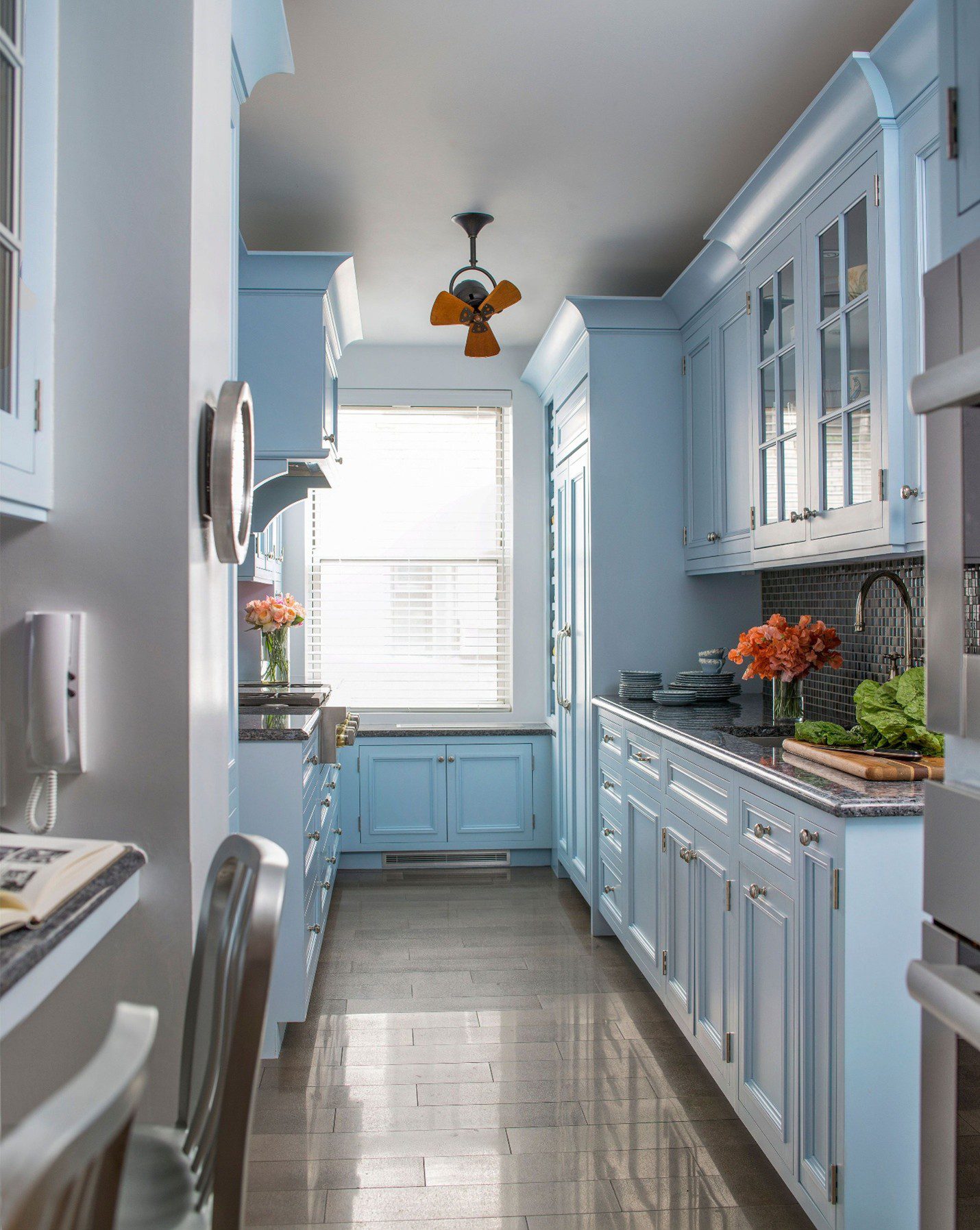
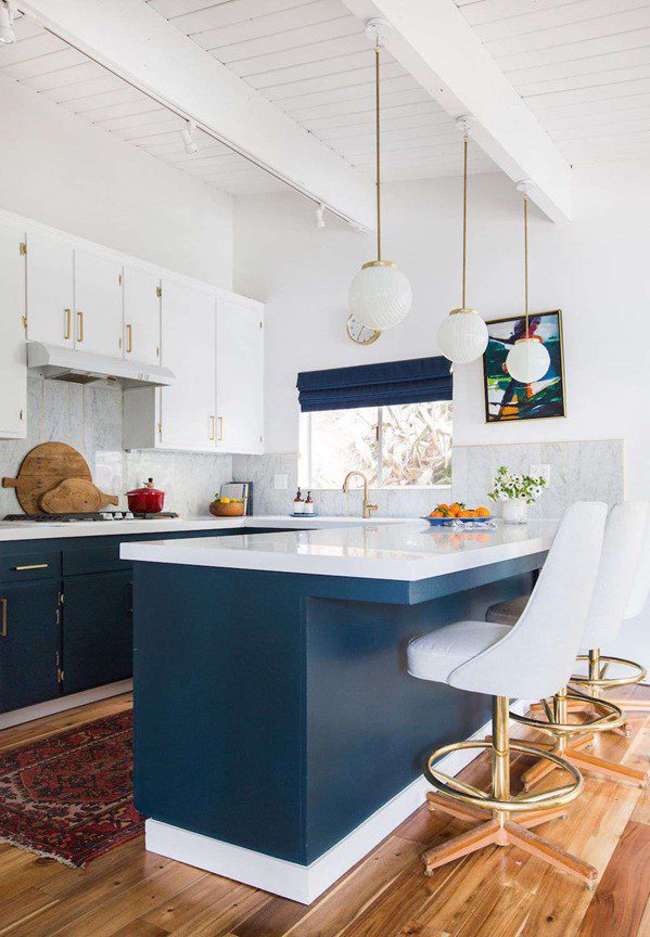
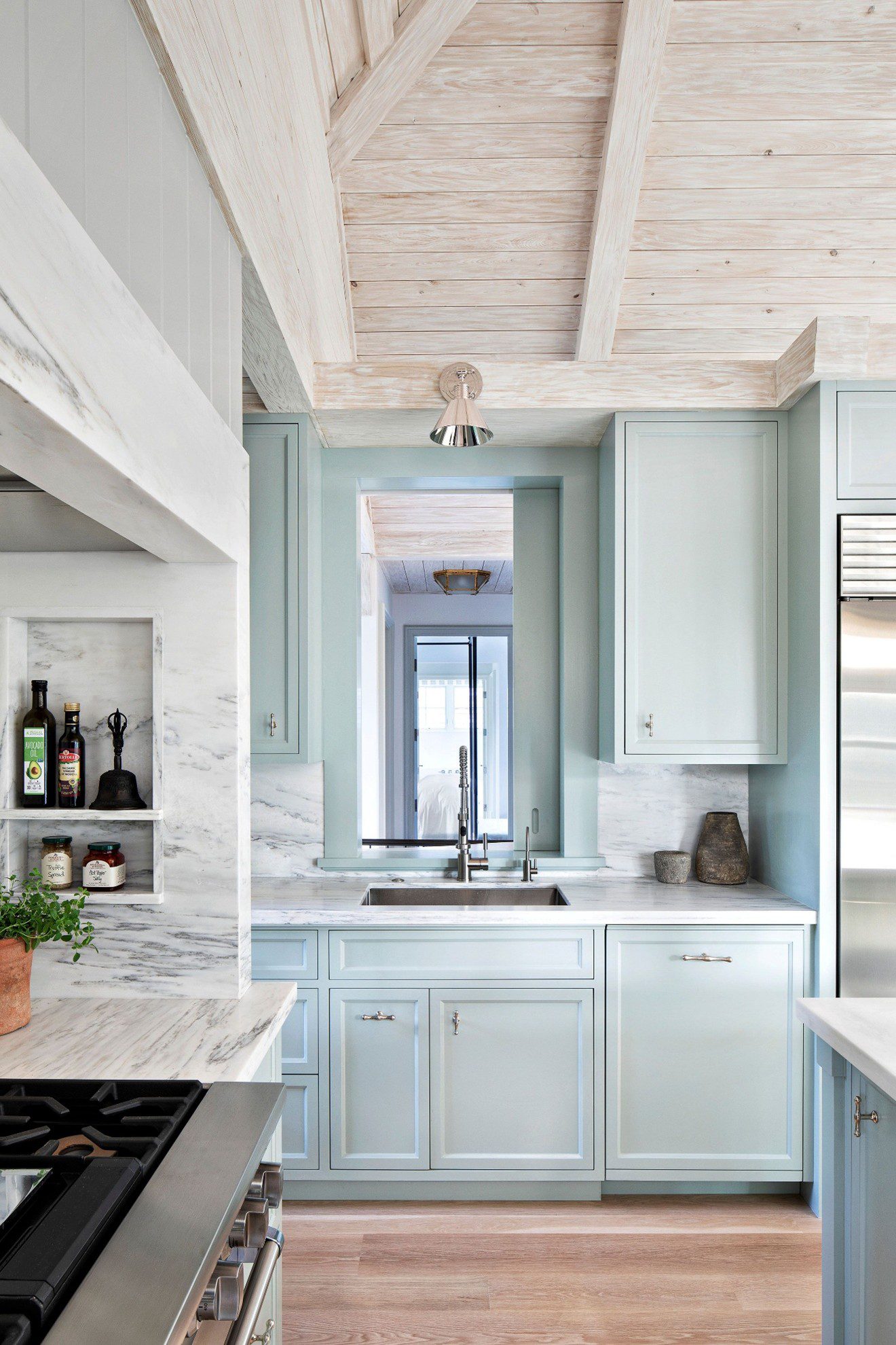
Duck egg blue cabinets + white walls + white marble worktop
Soft blue tones evoke sky and sea, naturally expanding the sense of space. Paired with crisp white surfaces, this palette feels light, relaxed, and timeless rather than trendy.
Best for: Kitchens with limited sunlight that need a fresh, uplifting feel.
Modern Scandi
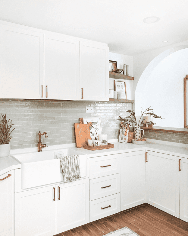
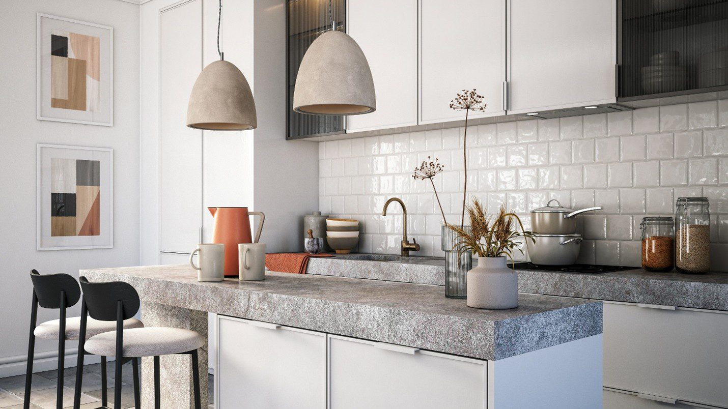
Pale grey walls + soft white cabinets + pale birch flooring
Inspired by Scandinavian design, this palette focuses on simplicity and light diffusion. The pale wood introduces warmth, while the cool grey keeps the overall look crisp and contemporary.
Best for: Compact apartments, open-plan living spaces.
Nature-Inspired
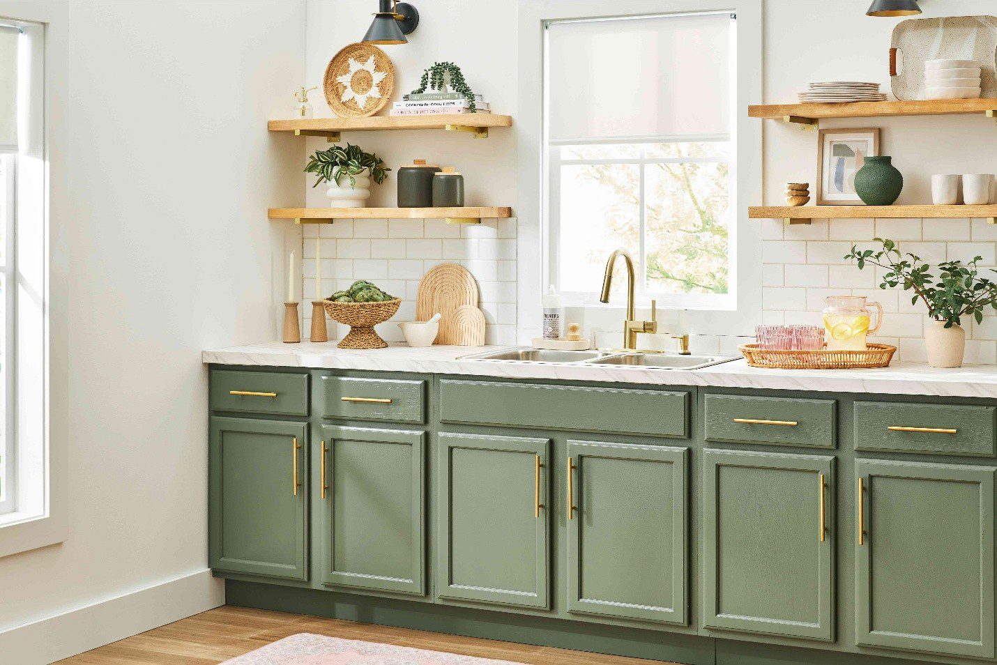
Sage green lower cabinets + cream upper cabinets + off-white walls
This layered, earthy palette grounds the space while maintaining brightness above eye level. The lighter upper cabinets prevent the green from overwhelming the room, preserving openness.
Best for: Homeowners who want colour without sacrificing airiness.
See More: Solid Wood vs. Plywood: Which Is Better for Your Kitchen Cabinets?
Bold Contrast
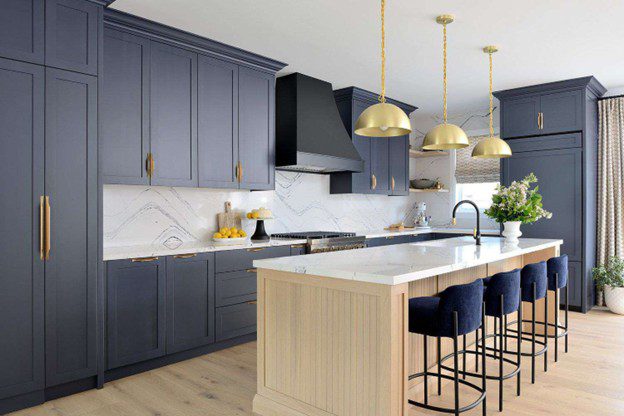
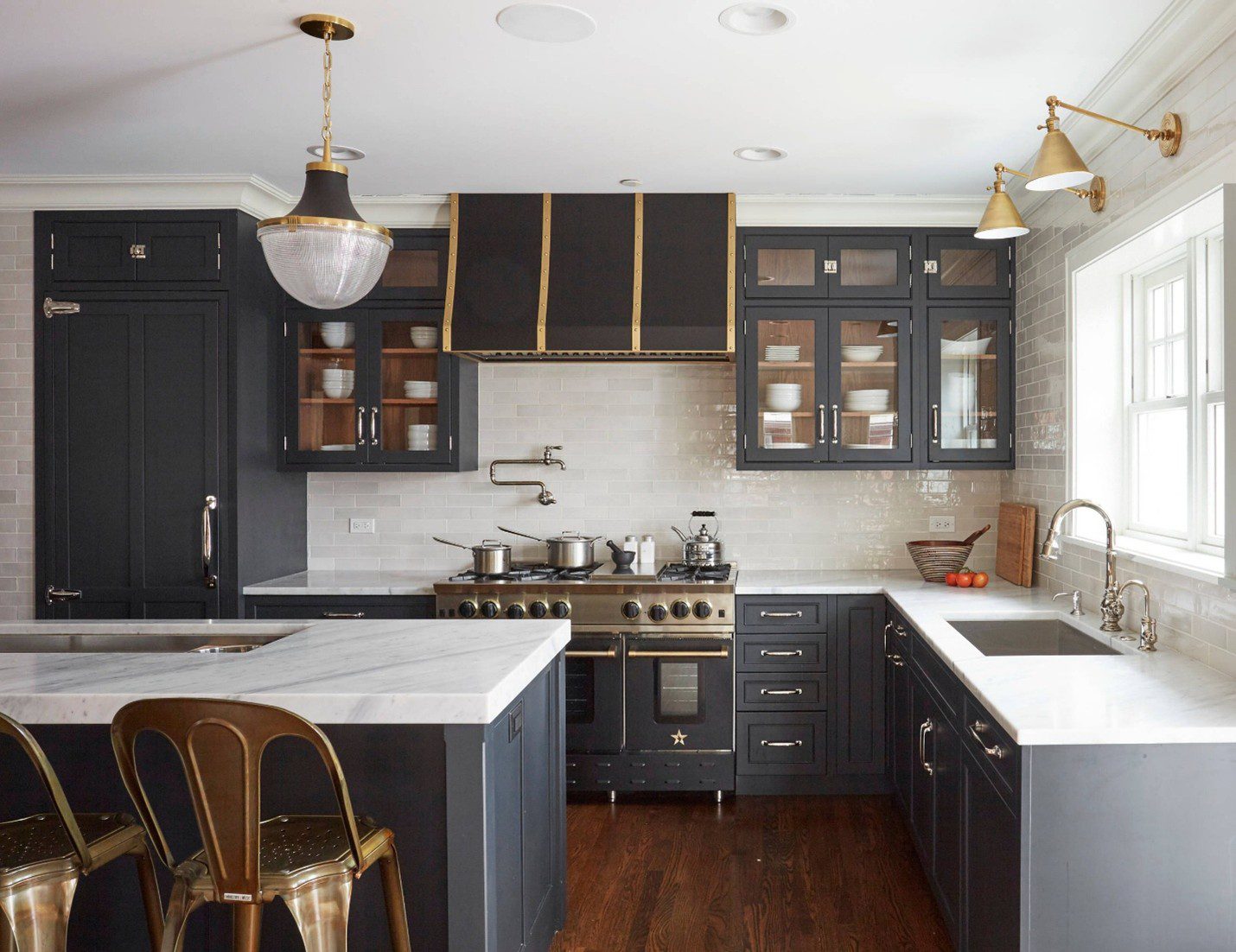
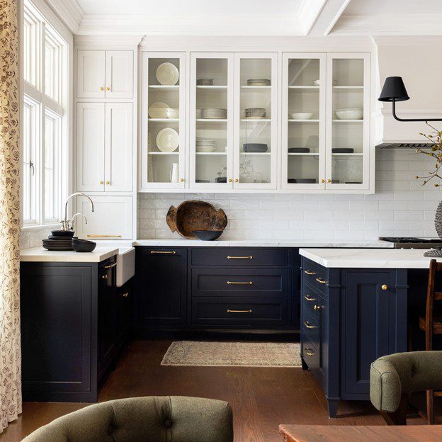
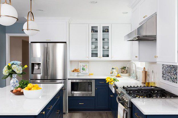
Navy lower cabinets + white upper cabinets + brass hardware + white walls
Dark lower cabinetry adds drama and sophistication, while white upper elements maintain lightness. Brass accents introduce warmth and refinement. This high-contrast strategy works because the darker tones remain below eye level.
Best for: Modern kitchens that want personality in a small footprint.
Frequently Asked Questions (FAQ)
Below are the five most common questions homeowners ask when choosing kitchen colours for small spaces.
| Q1: What is the best colour to make a small kitchen look bigger? |
| A: White, off-white, and soft light neutrals such as greige or pale grey are the most effective colours for making a small kitchen appear larger. These shades reflect both natural and artificial light, reduce visual clutter, and create a seamless look when used on both walls and cabinetry. If you want some warmth, a soft cream or warm white works equally well and avoids a sterile look. |
| Q2: Can I use dark colours in a small kitchen without it feeling cramped? |
| A: Yes, but the key is strategic application. Rather than covering all surfaces in dark colour, try using a deep tone — such as navy, forest green, or charcoal — only on lower cabinets or a kitchen island, while keeping upper cabinets and walls in a light shade. This two-tone approach adds drama and depth without closing in the space. Pairing dark cabinets with high-gloss finishes also helps by reflecting more light. |
| Q3: Should kitchen cabinets and walls be the same colour in a small kitchen? |
| A: Using very similar or matching colours on both cabinets and walls is one of the most effective tricks for visually expanding a small kitchen. When the eye does not have to jump between contrasting surfaces, the space reads as larger and more cohesive. You do not have to use the exact same shade — a slightly lighter wall tone paired with slightly deeper cabinets works beautifully while still maintaining that seamless look. |
| Q4: Does the direction my kitchen faces affect which colours I should choose? |
| A: Absolutely. The orientation of your kitchen determines the quality and temperature of natural light it receives throughout the day. North-facing kitchens receive cool, indirect light — warm tones like cream, warm white, and pale yellow help counteract the coolness. South-facing kitchens enjoy warm golden light, which means cooler shades like pale blue, sage green, or soft grey will look balanced and refreshing. Always test paint samples in your own kitchen light before making a final decision. |
| Q5: Are there any colour combinations I should always avoid in a small kitchen? |
| A: The combinations most likely to make a small kitchen feel smaller are: very dark walls paired with dark cabinets (which eliminates all light reflection), high-contrast colour blocking (which visually chops the room into smaller sections), and bold statement walls in deep or saturated tones (which advance toward you and reduce perceived space). Heavily patterned surfaces on multiple walls should also be avoided, as they create visual noise. Instead, keep large surfaces light and simple, and reserve any bold colour or pattern for a single splashback or accent detail. |
Conclusion
Choosing the right kitchen colour for small spaces does not have to be a daunting task. By understanding how colour, light, and finish work together, you can transform even the most compact kitchen into a bright, beautiful, and functional space.
Start with a light, neutral base — white, off-white, or a soft grey or greige — and then build in personality through hardware, textiles, and a carefully chosen accent colour. Test your palette under your actual kitchen lighting, consider your cabinetry finish, and do not underestimate the power of a continuous colour flow from wall to cabinet to floor.
With the right choices, your small kitchen can feel every bit as impressive as a much larger one.
